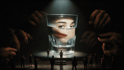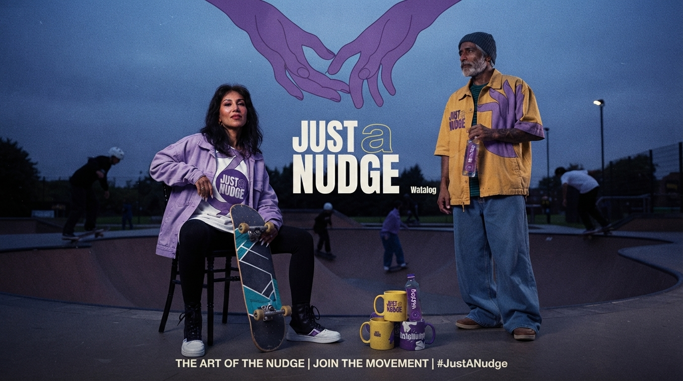
Watalog came to Zerologic as a bottled water brand. It left as a social gesture. This is the story of the identity built to carry that shift.
The brief: another bottle on a crowded shelf
Watalog arrived at Zerologic the way most consumer projects do, with a clear and modest mandate. A bottled water brand for the Indian market, accessible pricing, strong shelf presence, a name and a look that could hold their own in a crowded aisle. On paper, a packaging job.
The category it was entering is one of the hardest in consumer goods. Bottled water sits close to a pure commodity. Blind tests routinely show that people struggle to tell one brand from another, so the shelf competes on the same three notes on repeat: hydration, purity, price. Distribution tends to win more often than design. A new entrant that plays those notes a little louder simply joins the noise.
So before touching a label, Zerologic asked a different question. Not how the bottle should look, but what a bottle of water is actually doing in people's lives. That question changed the brief entirely.
The insight: a quiet wave of loneliness
The research kept returning a feeling rather than a fact. Across urban India, a generation fluent in group chats sits stalled at the first move, the message typed and deleted, the greeting swallowed before it reaches anyone. Call it a quiet wave of loneliness, the specific ache of wanting to connect and finding the opening line harder than it should be.
Alongside it ran a second finding. Water had already left the realm of pure function. The bottle on the desk had become a small signal of identity and care, an object people carry, share and offer without thinking. Put the two together and the opportunity became clear. Water was already a social object. It simply waited for a design that made that role deliberate.
The reframe: from beverage to social gesture
This is the move that defines the brand. A bottle is among the most transferable objects we carry, and handing one to another person is one of the oldest greetings we have, a wordless way of saying "I see you, I am here." So Zerologic moved Watalog off the crowded hydration shelf and repositioned it as a social gesture. Product as trigger rather than beverage. Consumption reframed as connection. A water nudge, built to start the exact moment people find hardest to begin.
That is the differentiator. While the category competes on hydration, purity and price, Watalog competes on connection. Everything that follows, every colour, character and line, exists to carry that one small act of care. Here is how the design makes it visible.
A name that reads like a confession
Watalog earns its strangeness honestly. The name is an amalgamation, water fused with catalog, and Zerologic chose it to stop describing a product and start describing a behaviour. A catalog is a living record, an ordered archive of things that move and belong together. So Watalog frames each bottle as an entry in that archive, a quiet catalogue of moments, gestures, and shared silences. The name works before the copy does. It tells you this is water made to be passed between people rather than simply finished.
The cap that says "Here to hear you"
The craft follows the concept all the way down to the lid. Zerologic set the wordmark in a rounded, confident hand beside the line "Just a Nudge," finished it with a gold cap, and drew it on classical proportion so the logotype feels balanced and unhurried, the way a considerate gesture feels. Where most bottles print a sales pitch, this one carries a promise: "Here to hear you." The brand introduces itself the way a good listener does, softly and with full attention.
One part rage, one part calm
Here the thinking turns genuinely elegant. Most brands select a hue. Zerologic assembled one, through a process it calls emotional mixing, and the logic reads like colour theory rewritten as psychology. Begin with two emotional extremes. Red carries rage, heat, urgency. Blue carries calm, distance, cool. Hold them together and something surfaces in the overlap: warmth. Push the mixture further and the two poles resolve into a single, complex third colour. Purple.
Meet Grape Gatsby, the purple with a point to prove
Zerologic gave the shade a name worthy of its ambition. Grape Gatsby, a deep saturated iris, sits at the centre of everything Watalog touches, its tagline reading like a mission statement in miniature: "Not red, not blue, just better." Purple Iris was chosen precisely because it holds contradiction. It is the colour of emotional complexity, visible proof that two opposing feelings can share one body at the same moment. For a brand built on human connection, few choices land closer to the message. The identity does more than depict empathy. It is mixed from it.
Gold gets loud, green keeps it grounded
Around that core, Zerologic cast a supporting palette that behaves like an ensemble. Bright Gold, a high-voltage #F8D100, brings celebratory warmth and sheer visibility, the flash of yellow that lets the brand raise its voice when it wants to be seen. Pistachio green and a cooler, dustier cold purple take the grounding roles, softening the intensity and giving the eye somewhere to rest. The full range travels from a near-black aubergine to the palest lilac, wide enough to carry a whole emotional register rather than a single mood. This is a palette engineered to feel, and only then to match.
Type that mumbles emotionally
The typography carries the same idea with a wink. Zerologic titled the type section "Type Talks (ours just mumbles emotionally)," which tells you most of what you need to know about the tone. The system pairs a structural, architectural headline face with a warmer hand-drawn companion, balancing clarity with intimacy so the words stay legible while still sounding like a person rather than a corporation. Structure holds the message together. Warmth makes you want to read it.
The faceless crew that feels everything
Then come the characters, and they may be the identity's most quietly radical move. Zerologic populated Watalog's world with a faceless illustrated cast it calls the Emoto Supreme, warmly and adorably awkward, thinking five thoughts at once. They wear blank features, carrying only body language and the occasional expressive eyebrow, and still they broadcast joy, confusion and full-blown chaos with startling clarity. Zerologic describes them as moods with eyebrows, characters that hold feeling in gesture because the brand decided, from its very first page, that even silence should be designed with feelings.
What Zerologic was really building
That last phrase holds the whole identity in five words. Zerologic treated visual design as emotional architecture, a system where every element earns its place by carrying a feeling. The name amalgamates water and record into a reason to connect. The colour amalgamates rage and calm into warmth. The typography amalgamates precision and softness into a voice. Even the characters amalgamate expression and restraint into gestures that say more than any caption.
The through-line, once you see it, stays seen. Amalgamation is the brand's native logic, the belief that the most human things live in the blend rather than at the poles. A lesser studio would have chosen purple because it tested well. Zerologic built purple, from feeling, and in doing so gave a bottle of water the one thing brands chase for years and rarely find: an interior life.
The short version
Watalog came to Zerologic as a commodity water brief in a category that competes on hydration, purity and price.
Zerologic reframed it as a social gesture, answering a rising wave of loneliness among urban Gen Z.
The identity was mixed from emotion. Its core colour, Purple Iris, blends red for rage and blue for calm into warmth.
Name, colour, type and characters all follow one logic, amalgamation, the belief that the most human things live in the blend.
Frequently asked questions
What is Watalog?
Watalog is a bottled water brand repositioned as a social gesture. Instead of selling hydration, it is designed to be offered and passed between people, a wordless way to say "I see you, I am here." Zerologic built its positioning and brand identity.
What makes Watalog different from other water brands?
Most water brands compete on hydration, purity and price. Watalog competes on connection. Zerologic reframed the product as a trigger for a social gesture rather than a beverage, moving it from consumption to connection.
Why is Watalog's brand colour purple?
The core colour, Purple Iris, was mixed from emotion. Red stands for rage and blue for calm, and their blend produces warmth and a complex third colour. Purple became visible proof that two opposing feelings can share one body, which matches a brand built on human connection.
What does the name Watalog mean?
Watalog amalgamates water and catalog. A catalog is a living, ordered record, so the name frames each bottle as an entry in a quiet archive of shared moments, gestures and silences.
Who designed Watalog's brand identity?
Zerologic, a brand strategy and execution consultancy, built Watalog's positioning, behavioural strategy and full visual identity, including the name, colour system, typography and character world.