Client
Watalog
Industry
FMCG
Outputs
brand · identity · web · strategy · content · campaigns
Year
2025
The brief
Watalog commissioned brand identity and packaging design for an accessible bottled water brand priced for broad reach in the Indian market. The brief was a product brief. Before design began, Zerologic asked what water was actually doing in the lives of the people it was for, and the answer moved the engagement from packaging a commodity to designing an object that gets handed to someone.
Context
Bottled water is India's least differentiated consumer category and one of its largest. The market is worth roughly USD 9.14 billion in 2026, with the mass segment holding around 85% of value. Competition in that segment runs on distribution and price, and the brands that win it are the ones already inside every kirana, station and canteen.
A new entrant cannot outspend that. It also cannot out-argue it, because the category's arguments are purity, safety and source, and the incumbents have made all three for decades. Entering on the category's own terms means competing where a new brand is structurally weakest.
Process
What we found
Two findings from consumer research, placed together, changed the brief.
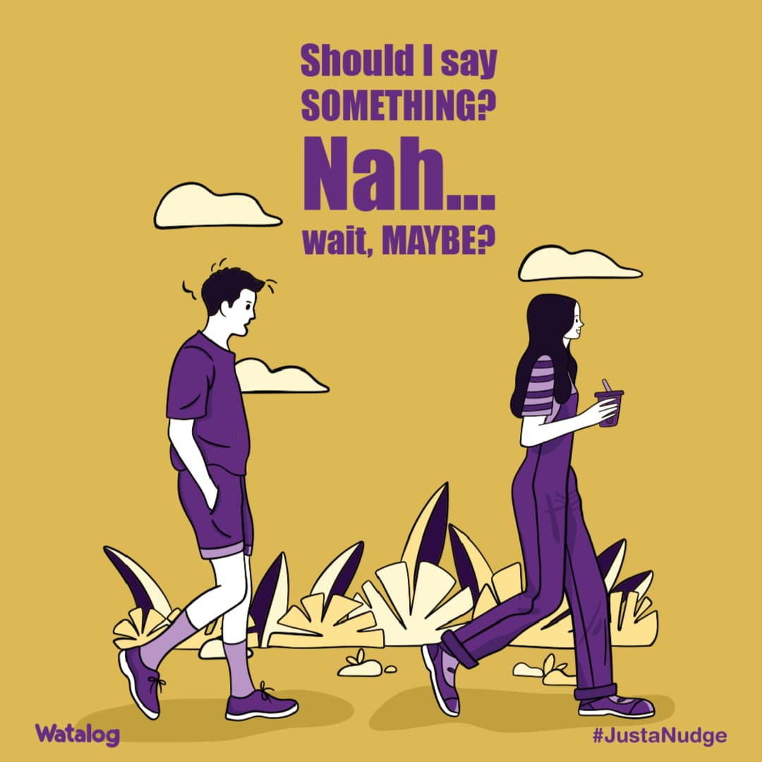
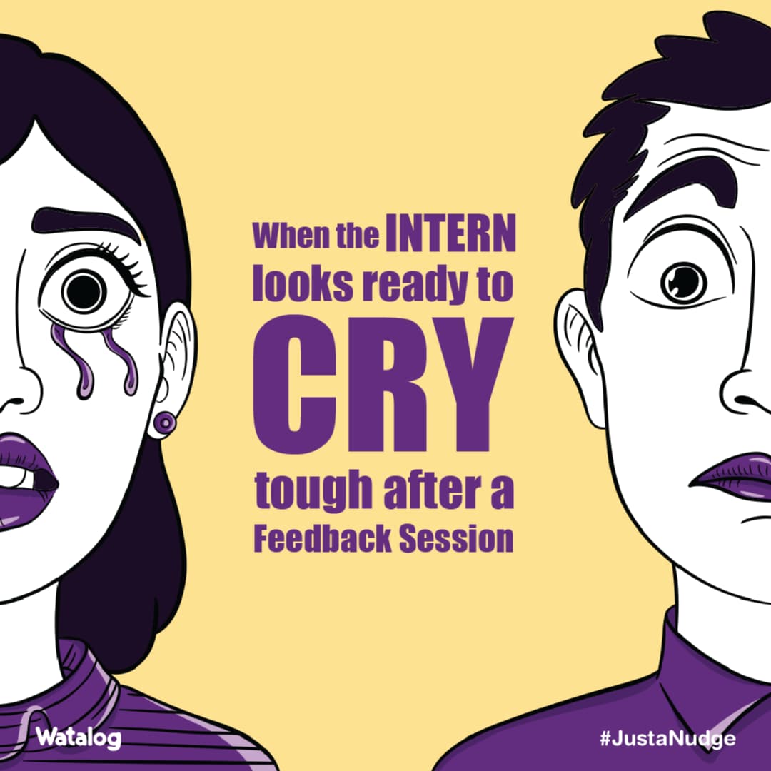
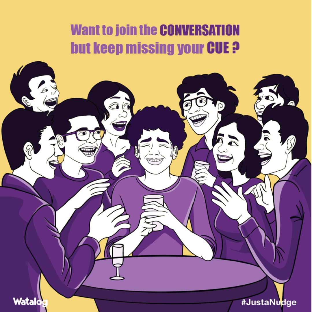
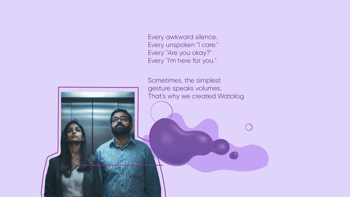
The first was the cost of initiating connection. Young urban Indians carry a high volume of unexpressed thought, and the friction of the first move is rising. One image recurred in interviews: the backspace pressed before a message is sent. Silence chosen over the effort of starting.
The second was that water already carries meaning. For Gen Z and millennial consumers, hydration has moved from biology into wellness practice. The bottle on the desk is a statement about how someone chooses to live.
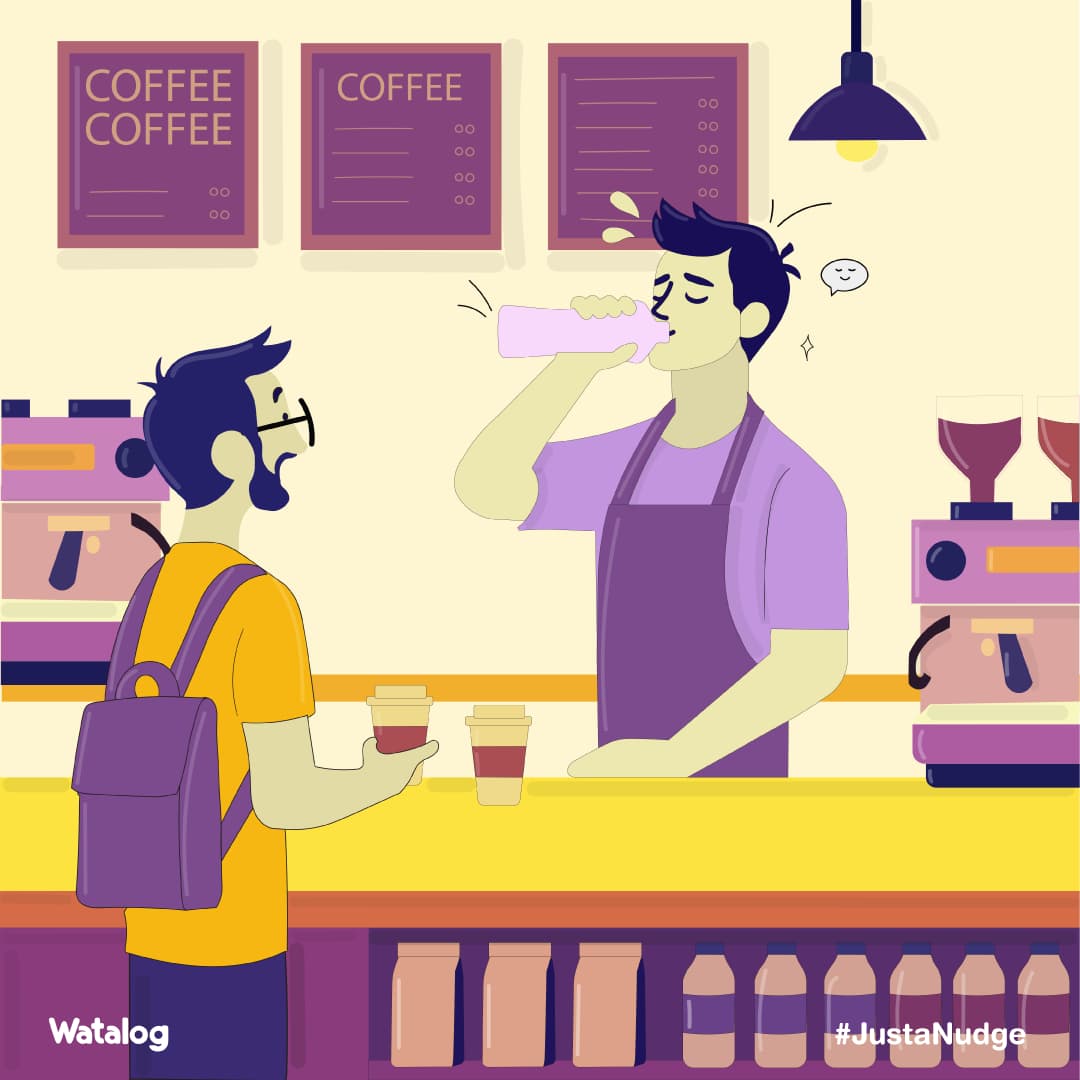
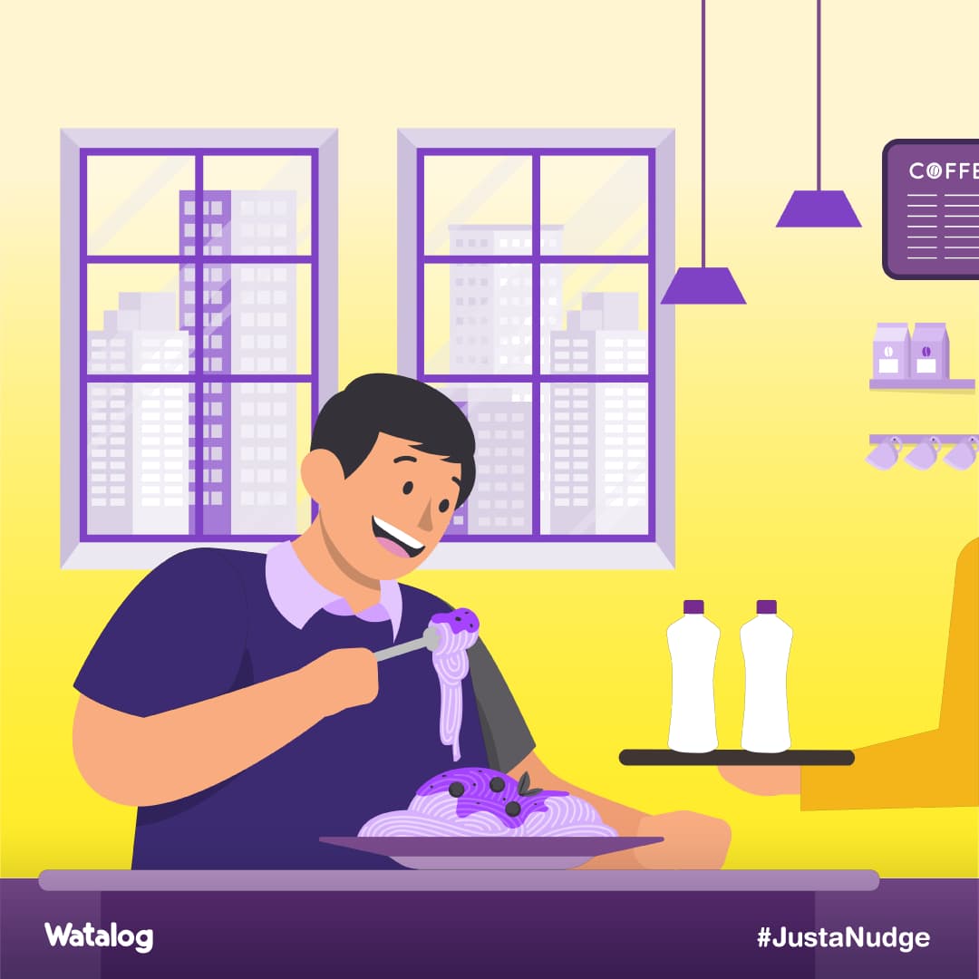
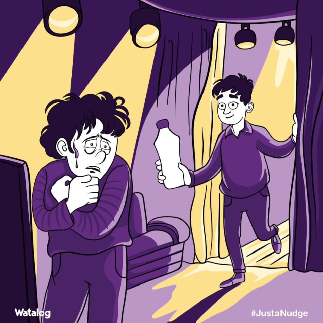
Water is already a social object. It was waiting for design to make that role deliberate. A bottle of water crosses more hands in a day than almost any object in daily life, and offering one is among the quietest universal expressions of care.
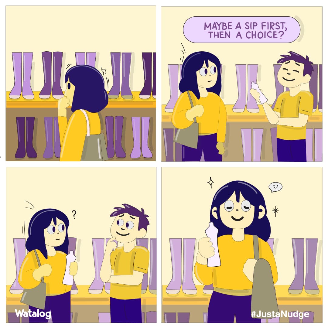
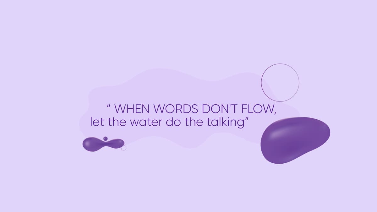
That set the positioning: from transaction to gesture, from single-use to circular participation, from category to culture. The line that governs it is an instruction rather than a claim. Let water do the talking.
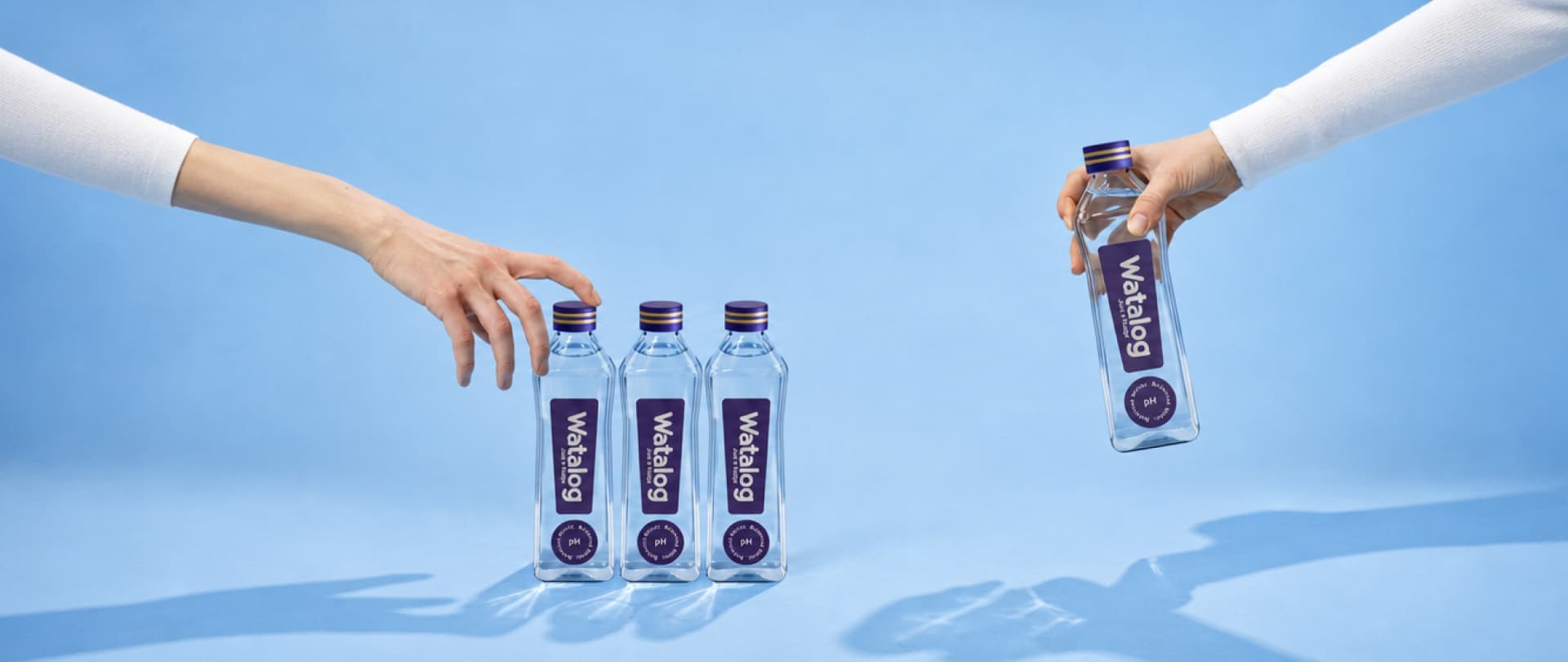
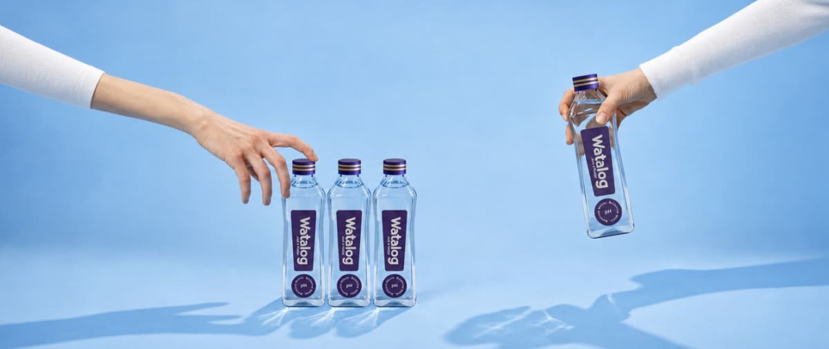
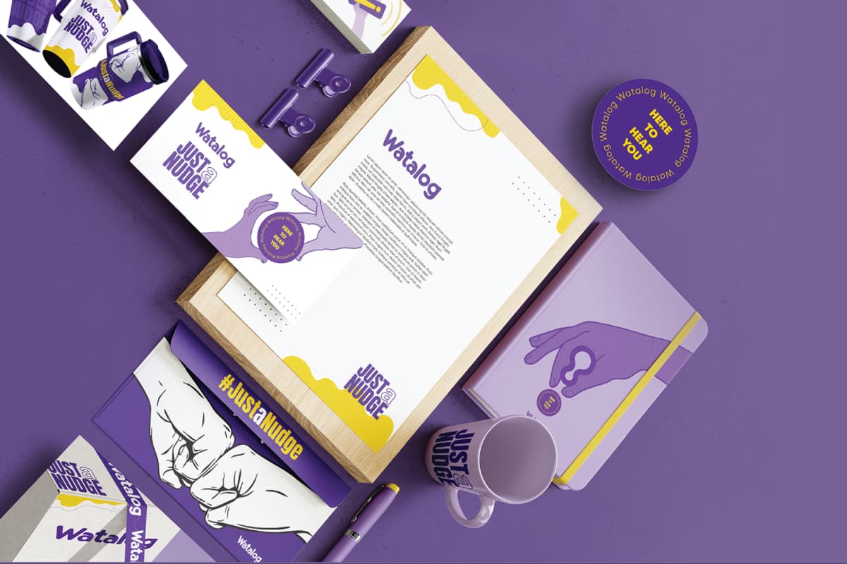
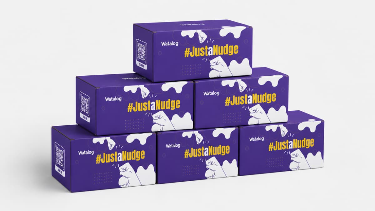
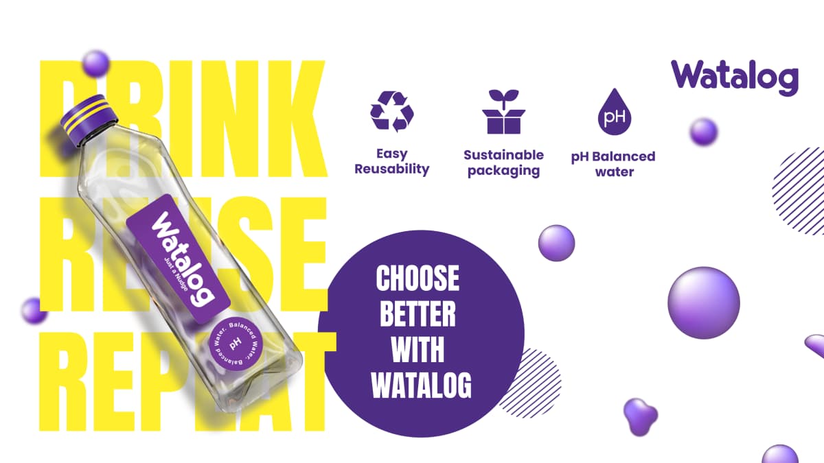
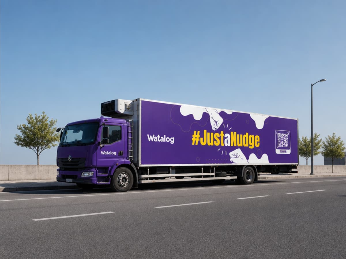
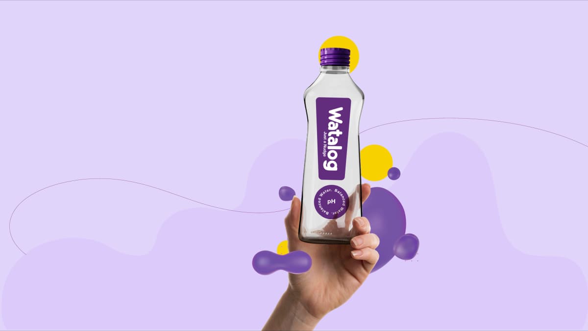
The system follows from it. The name encodes the strategy: water plus catalog, an archive of shared moments rather than a product category. The bottle is glass, because glass signals an object worth returning and survives the cleaning and refill cycles the loop requires. The label is reduced to a gold exclamation mark and four words, Here to hear you, so the bottle carries the gesture and the label only confirms what it means. Purple Iris is the primary colour, derived from red and blue held in tension, the convergence point between expressive intensity and composed calm. The campaign line, #JustaNudge, is built around the word just, which lowers the activation energy required to make the first move.
The return loop was specified as a product feature from day one rather than appended as a sustainability programme. Recyclable products leave the brand's ecosystem when discarded. Watalog's bottles re-enter it.
Output
Reflection
The restraint was the risk. In a category where communication is loud and shelf presence is bought with saturation, a quiet bottle with a four-word label is a bet that recognition beats volume. That bet only pays if the gesture is self-explanatory in the hand, which is why the object had to satisfy three behavioural requirements at once: it had to be good to hold, good to give, and easy to return. Those optimise differently, and the design resolved them together rather than sequentially.
The Hyderabad pilot put over 300,000 units into circulation across five months, and the return loop held through partner stores, cleaning, refill and redistribution. What that proved is narrower and more useful than a sales figure: the loop participation behaviour was learnable and repeatable in a real urban environment, without additional communication spend to explain it.
A brand built on a gesture is a claim until someone performs the gesture unprompted. That is the difference between the positioning and the proof.
Creative outputs