

Client
Research Realm
Industry
SaaS
Outputs
brand · identity
Year
2023
The brief
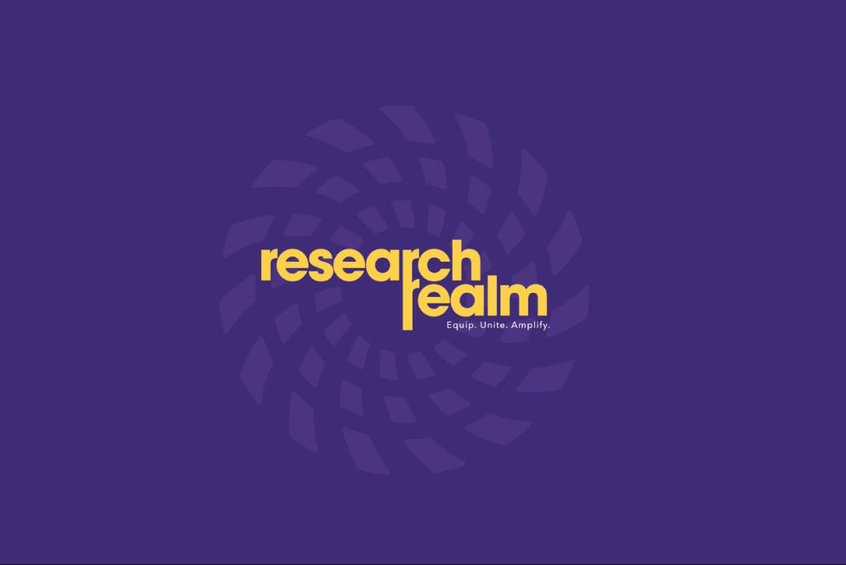
Research Realm commissioned brand identity design for a research platform that was technically ahead of its communication. The founding team was building a brand from scratch and treated identity as a visual exercise to be completed once the product was finished. The engagement mattered because the sequence was inverted. What the platform needed was a way for a buyer to recognise its credibility before committing to a demo, and that is a positioning outcome, not a design one.

Context
Brand strategy for SaaS companies converges visually long before the market converges commercially. Research and knowledge tooling had settled into one register: soft gradients, generous radii, a friendly geometric sans, illustration standing in for evidence. That register communicates ease of use consistently across the category.
Ease of use is the wrong argument to lead with here. A researcher or an institutional buyer is not weighing whether a tool is pleasant. They are weighing whether its output holds when a supervisor, a reviewer, or a paying client questions the conclusion. The category was communicating comfort to a buyer whose actual concern was defensibility.
Process




What we found
Brand positioning for B2B platforms usually argues capability. This one had to argue conduct. Buyers of research infrastructure do not evaluate credibility, they infer it, from precision, consistency, restraint, and whether the brand behaves as though it has nothing to prove.
A research platform is trusted when it feels rigorous, not when it looks clean. Clean is a finish. Rigour is a structure, and structure shows in how a system is built rather than in how it is decorated.
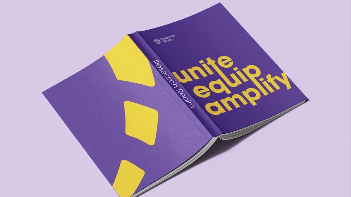
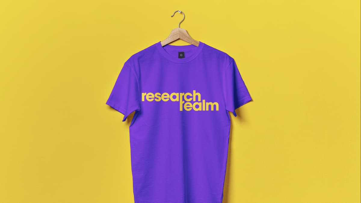
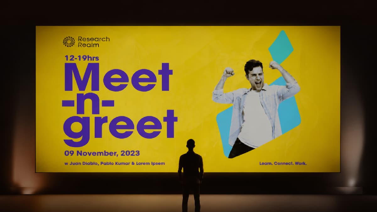
That finding changed the deliverable. Brand identity design for a research platform is not a logo applied to a finished product. It is a set of rules that makes future decisions, including ones made by people not yet hired, resolve in the same direction. Zerologic set the brand on one axis: demonstrated rigour. Applied to any decision it asks a single question. Does this show the work, or smooth over it.
Output



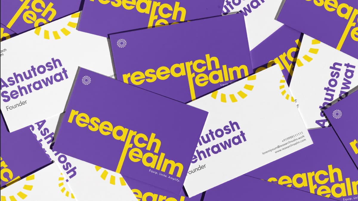
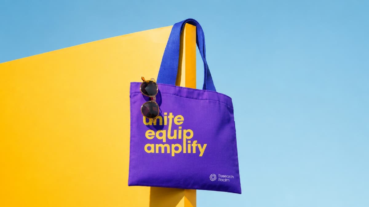
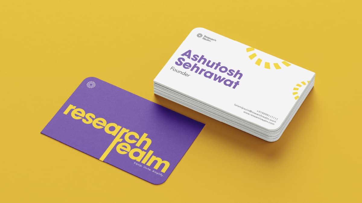
Reflection
The positioning axis did more work than the identity did. Once demonstrated rigour was fixed, questions the founding team had been circling stopped being matters of taste: how much to explain, how technical the language should be, whether to compete on approachability.
The trade was accepted knowingly. A brand that reads as rigorous in a category that reads as friendly will look austere in a side-by-side comparison. That was the point, and it required agreement before a mark was drawn rather than after the first round of feedback.
The architecture also had to carry a requirement absent from the brief. Summarise was already in build and would need to stand alone in market while staying connected to the parent system. Specifying the identity as rules with stated conditions of use, rather than as references, is what made that stretch possible without fragmenting the brand.
Zerologic ran this as a brand strategy consultant engagement rather than an identity commission. That is the difference between a brand positioning agency brief and a design brief: the positioning is the deliverable, the identity is the output. The same sequence governs every brand identity consultant engagement the firm takes.