Little knowledge is dangerous. Research Realm was built to make sure no decision-maker ever had to rely on it.
The challenge
Research Realm arrived at a defining moment: a sophisticated data and human-insight platform capable of serving businesses, governments, think tanks, and private sector decision-makers — with a brand that could not yet carry the weight of what the platform could do.
Client
Research Realm
Category
B2B · Data & Intelligence · Research Platform
Phase
Build
Capabilities
3 deployed
The insight
Research Realm existed to address a specific danger: the danger of little knowledge. That single premise — borrowed from Alexander Pope and made operational — reframed everything. The brand was built to position Research Realm not as a research platform among many, but as the infrastructure that separates informed decisions from dangerous ones.
01 · Define
A Single Strategic Premise Resolved Every Brand Decision That Followed.
Research Realm's founding team came to Zerologic with a brief that sharpened as the engagement progressed. That sharpening was the work. The initial conversation surfaced a business with genuine scope: a platform capable of supporting large-scale quantitative surveys, on-ground demographic research, and real-time decision intelligence for institutions operating at national and policy scale.
The gap between what the platform could do and what the brand could communicate was the first problem to resolve. Before any identity work began, Zerologic worked with the founding team to establish three foundational outputs: a purpose statement, a values architecture, and a positioning premise that would govern every downstream decision.
The purpose statement emerged from one question: why does Research Realm exist? The answer the founding team arrived at was precise. Research Realm exists to provide accessible research resources and a nurturing culture of learning and mentorship — to address the challenge that little knowledge is dangerous — by enabling people to attain maximum knowledge, driving positive and meaningful change in a dynamic world. That sentence is not a tagline. It is an operating principle. Every brand decision from that point forward was tested against it.
The values architecture identified five qualities that would define how Research Realm operates: Empowerment, a Sense of Compassion, Resilience, Curiosity, and Vision. These were not abstract aspirations. They were the qualities the founding team demonstrated in the engagement itself — the willingness to examine assumptions, to revise direction when the evidence required it, and to commit to a brand built on what the business genuinely stood for rather than what sounded appropriate for the category.
The positioning work established that Research Realm sits at the intersection of three forces: empowering individuals globally, serving as an invaluable tool of research, and enabling efficient and holistic progress. That three-part framework became the structural logic behind the identity system. The platform's purpose was not to conduct research. It was to unite, equip, and amplify the people and institutions who needed it.
The DEFINE phase produced a brand that the founding team could explain in a single conversation — to a government procurement officer, a think tank director, a private sector strategy lead, or a student seeking to understand how research works.
A Visual System That Made Intellectual Ambition Legible Without Making It Inaccessible.
The BUILD phase translated the DEFINE work into a visual identity system designed to hold two audiences simultaneously: the institutional decision-maker who needed to trust Research Realm before engaging with it, and the individual researcher, student, or professional who needed to feel that the platform was built for them. Most research brands serve one of these audiences well. Research Realm needed to serve both.
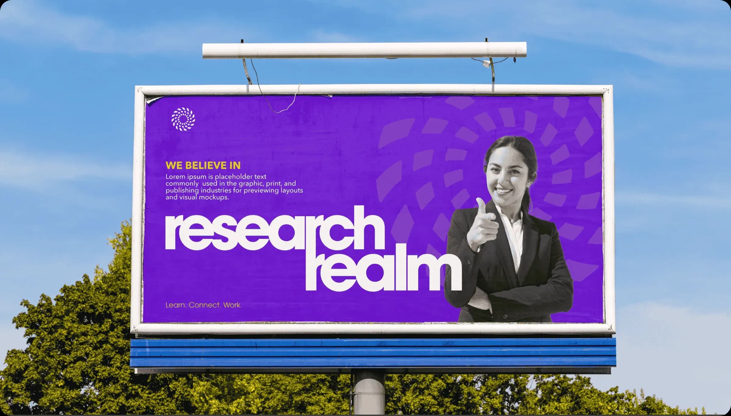
The logo construction began from the platform's structural logic. Research Realm operates across three pillars: Learn, Connect, Work. The Realm Wheel is a circular symbol constructed from layered, spiralling fragments that converge toward a negative space centre. Three colour-coded elements — purple for Learn, gold for Connect, turquoise for Work — are embedded within the mark. The surrounding fragments rotate outward from the centre, communicating the idea that research is endless: it spirals outward from a question, not toward a fixed answer. The negative space at the centre represents the realm itself.
The colour strategy resolved a specific challenge: Research Realm serves both B2C audiences and B2B audiences. A conventional research platform palette would serve the second audience but lose the first. French Violet (#6C00D0) is the primary colour — communicating wisdom, idealism, and an unconventional approach. Gold (#FFD600) is the secondary colour, carrying associations of youthfulness, confidence, and the symbolism of knowledge. The combination is high-contrast, memorable, and entirely distinct from every competing platform in the category.
The primary typeface is ITC Avant Garde Gothic — deployed at display scale for maximum impact and specified across five heading levels and three body sizes. A typeface with that provenance signals that Research Realm is part of a longer intellectual tradition: forward-thinking by design, not by declaration.
Research Realm was positioned as a realm of four qualities simultaneously: Bold, Playful, Assertive, and Idealistic. Each quality was given its own visual expression. This system acknowledges that a platform serving as many contexts as Research Realm cannot communicate with a single register. The identity system was built to hold all four without contradiction.
The identity system was specified across stationery, digital, out-of-home, and branded merchandise. Each application demonstrates the same principle — the French Violet ground, the Realm Wheel mark, and the Avant Garde Gothic wordmark maintaining a consistent register regardless of scale or surface.