Skip to content
1 / 3
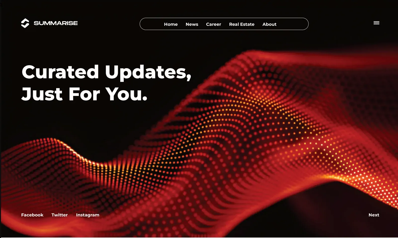
Summarise — hero

02 / 02Summarise

B2C · Content Platform · Mobile App

Summarise

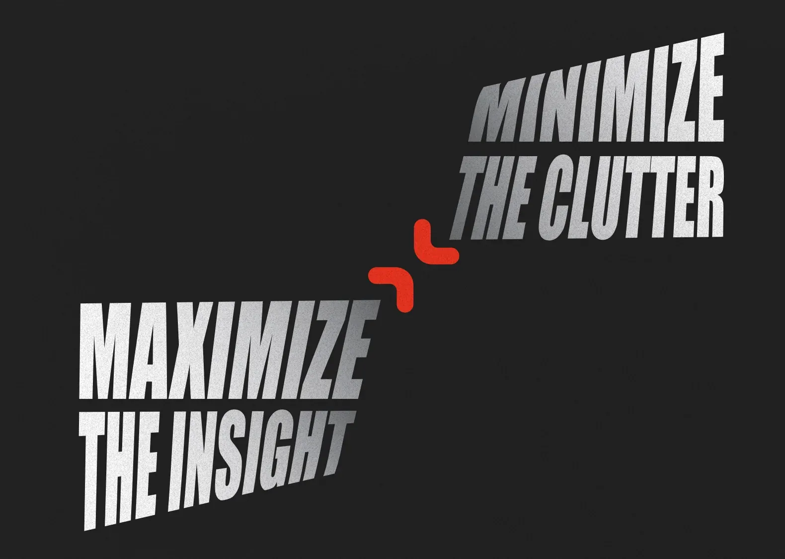
Minimize the clutter. Maximize the insight. Summarise needed a brand that did both before a user opened the app.

The challenge

Summarise is a product built on Research Realm's infrastructure — but it speaks to a fundamentally different user in a fundamentally different register. Where Research Realm serves institutions making high-stakes decisions, Summarise serves Gen Z users who want to stay informed without being overwhelmed. The brand challenge was precise: Summarise needed its own identity — one that could stand independently on an app store, compete for attention on a Gen Z home screen, and communicate its core proposition in a single glance — while remaining architecturally coherent with its parent platform.

Client

Summarise

Category

B2C · Content Platform · Mobile App

Phase

Build

Capabilities

4 deployed

The insight

Gen Z does not have a news consumption problem. It has a trust problem. The generation that grew up with algorithmic feeds, misinformation cycles, and platform-manufactured virality has developed a well-founded skepticism toward content that arrives without a verifiable human source. Summarise's competitive position was not aggregation — every major platform aggregates. It was verification: content sourced from real humans with knowledge, matched to the user through a proprietary system, and available for fact-checking before consumption.

01 · Define

The Brand Had to Do What the Product Does: Compress Without Losing the Core.
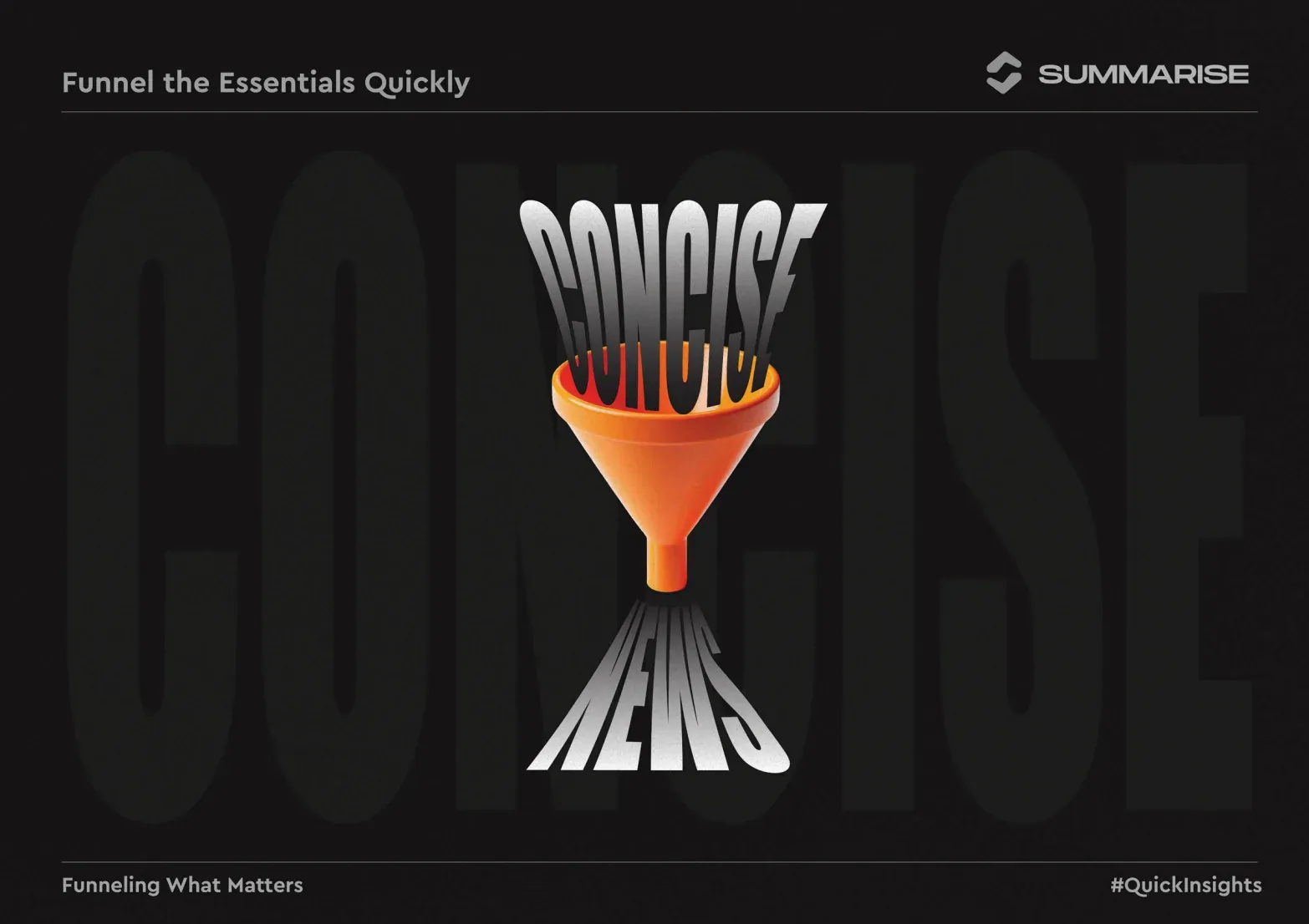
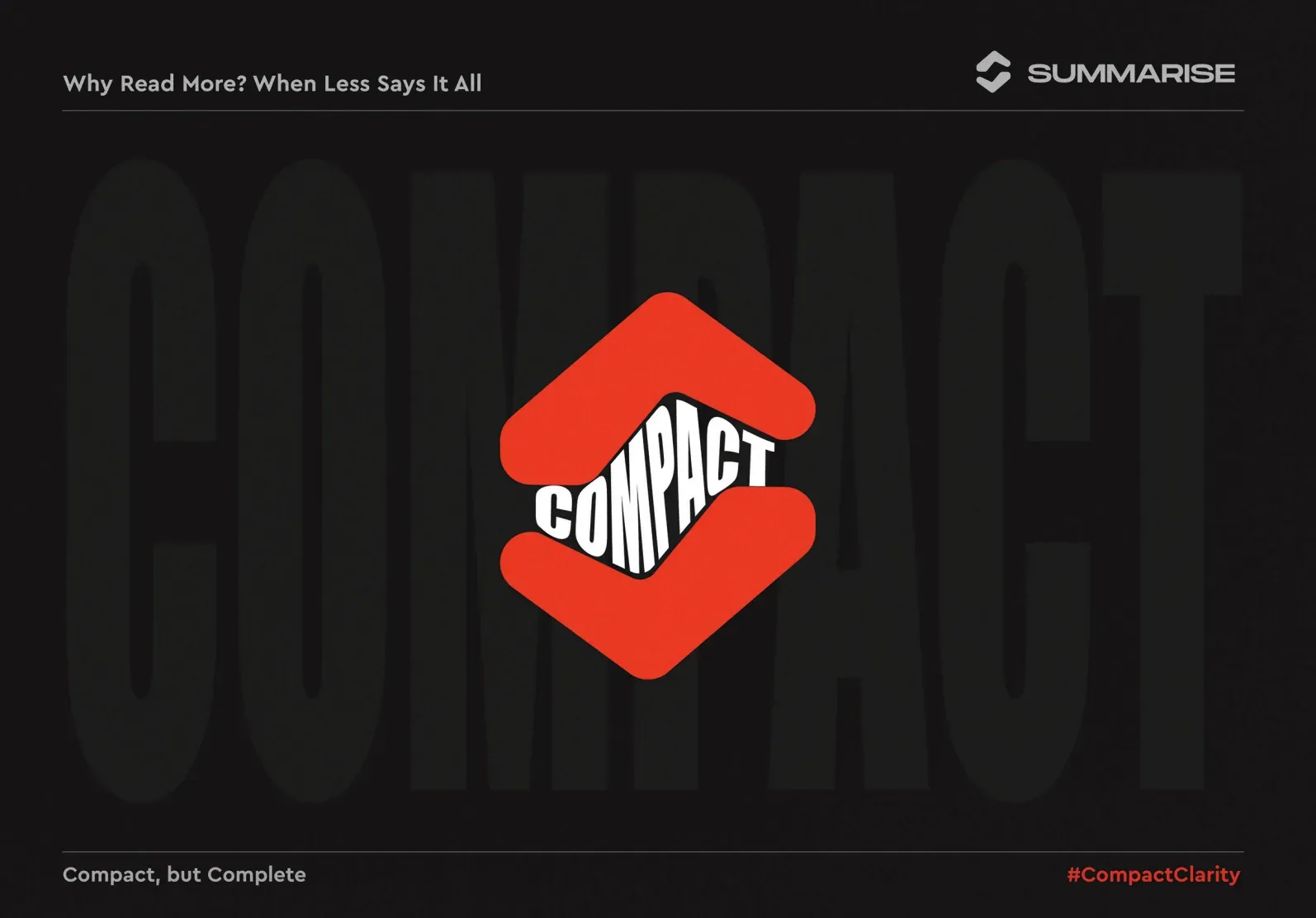
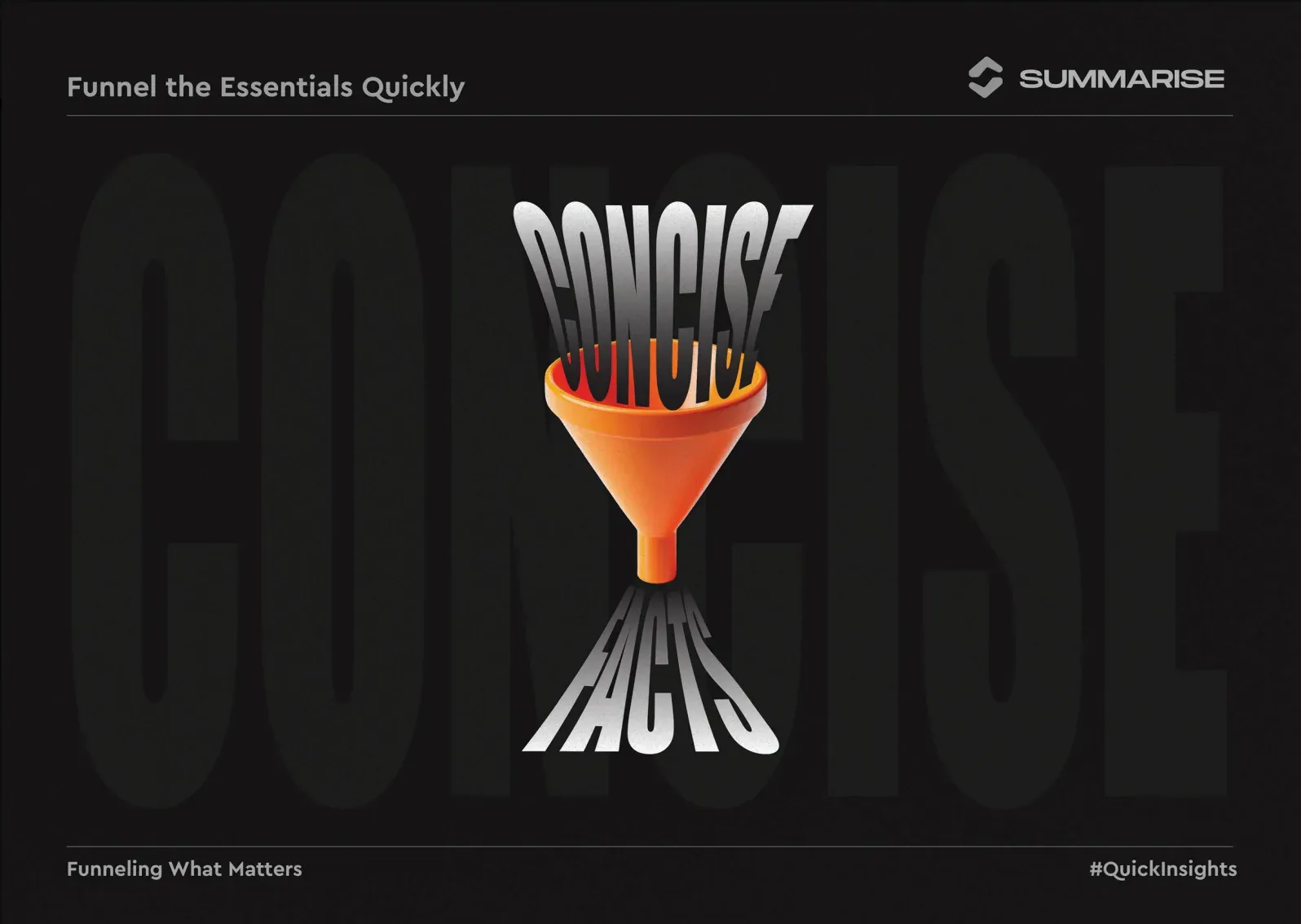
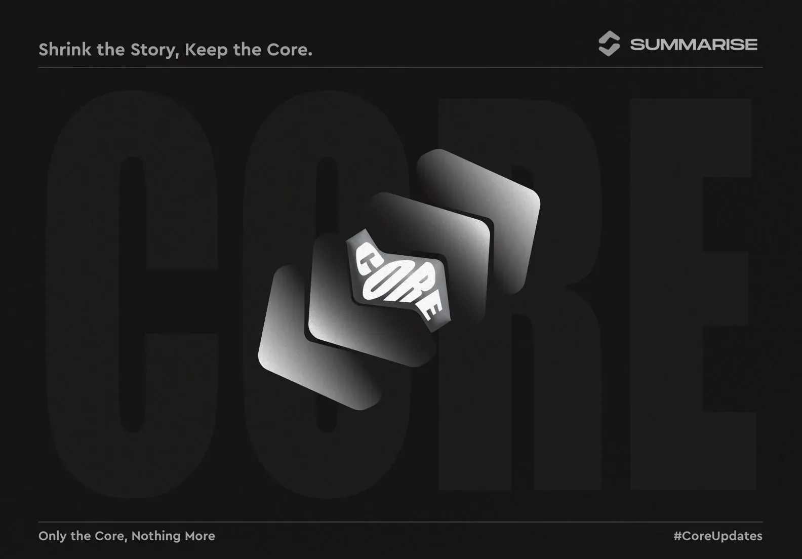
The positioning work for Summarise began from a precise understanding of its user. Gen Z consumes information in compressed formats — short-form video, threaded posts, push notifications — not because attention spans have shortened, but because the signal-to-noise ratio on most platforms has made long-form consumption an unreliable investment of time. A user who cannot trust that what they are reading is accurate has a rational incentive to read as little as possible before making a judgement. Summarise was built to change that calculus. That distinction became the strategic foundation of the brand. The positioning work identified three operating principles that would govern every product and brand decision: Core — keep only what is essential. Concise — communicate it in the fewest words that carry the full meaning. Compact — make it accessible on any screen, in any moment, without loss of quality. The brand proposition that anchored the communication system followed directly: Minimize the Clutter. Maximize the Insight. This framing named the user's actual problem and the product's actual output in a single sentence that required no category explanation and no feature list. It worked as a brand statement, a product description, and a creative brief simultaneously. The product tagline — Shrink the Story, Keep the Core — operationalised the same principle at the content level. It told the Gen Z user exactly what Summarise does in the register they respond to: direct, unambiguous, and respectful of their time. It also encoded the platform's human-intelligence differentiator: the core is kept because humans with knowledge have curated it, not because an algorithm has guessed at what matters. The communication vocabulary that emerged from this phase — Core, Concise, Compact, Condense, Only the Core Nothing More, Funnelling What Matters — gave the brand a consistent tonal register that could be deployed across social, in-app, and campaign contexts without creative drift.

Zerologic Summarise_11
System
Zerologic Summarise_12
System
Zerologic Summarise_13
System
Zerologic Summarise_14
System
Zerologic Summarise_15
System

02 · Build

A Mark Built from Human Gesture. A System Built to Compound.
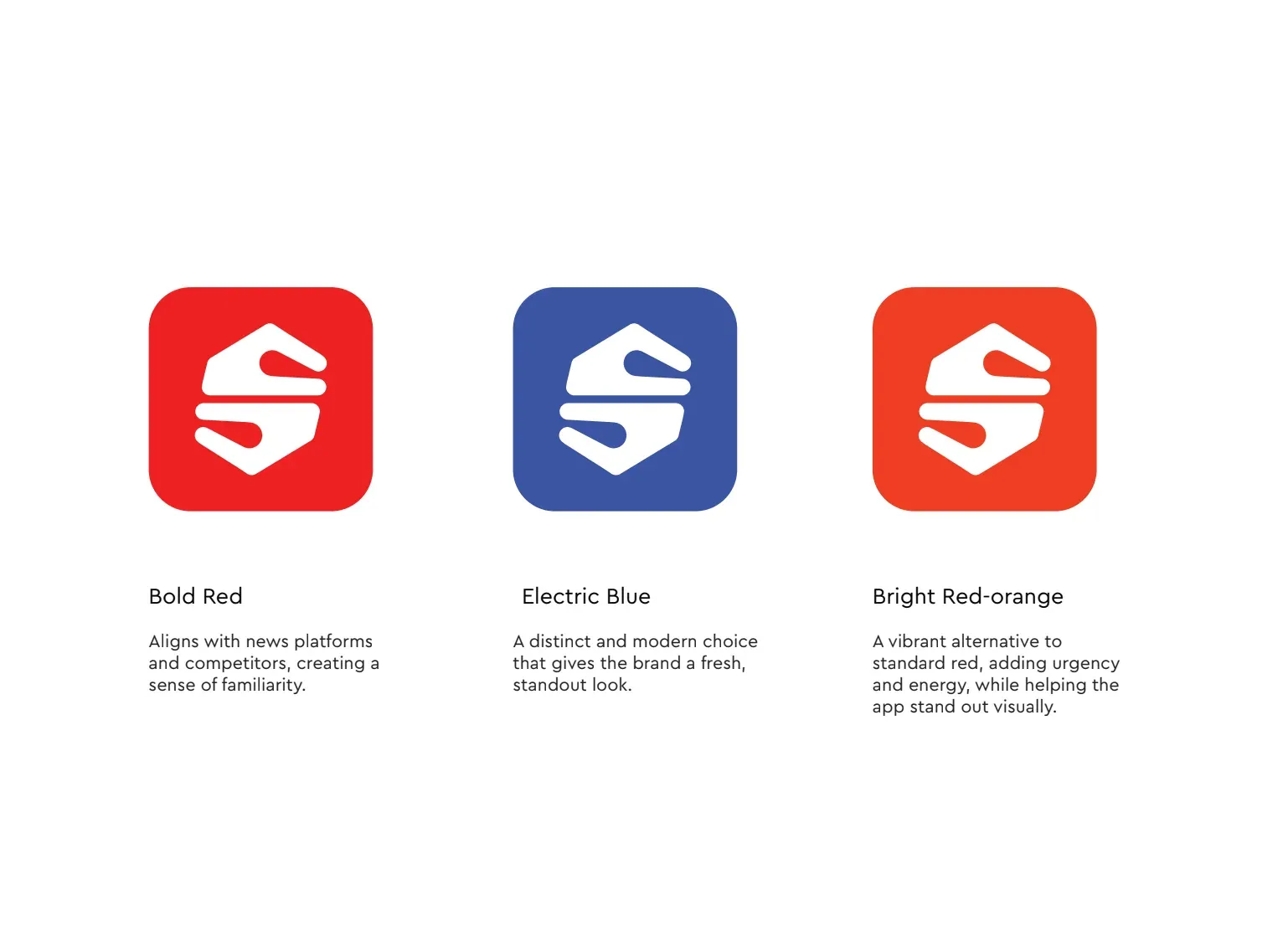
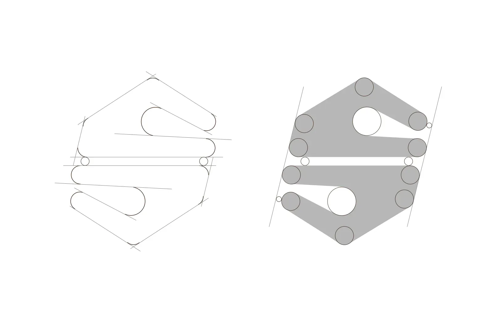
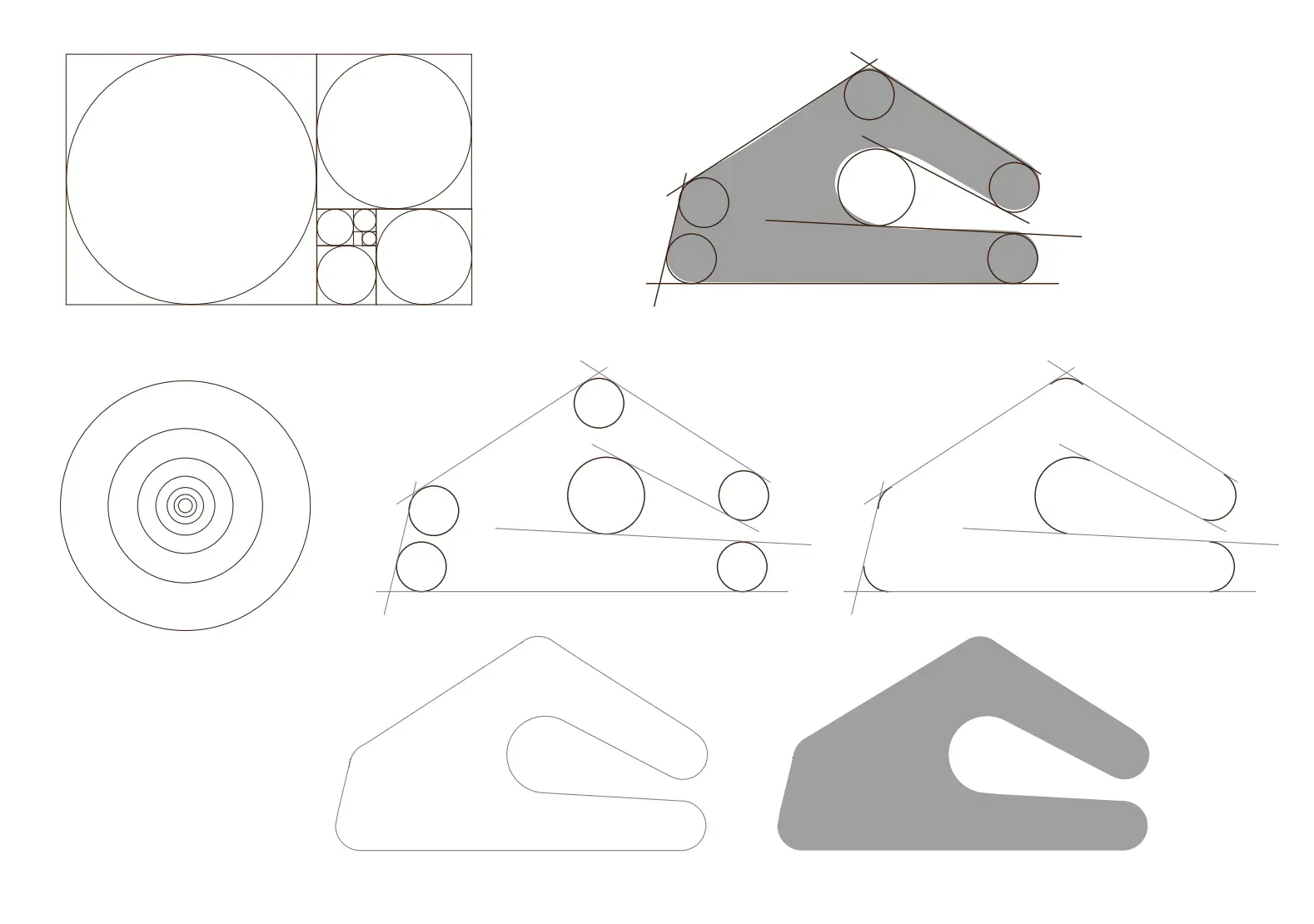
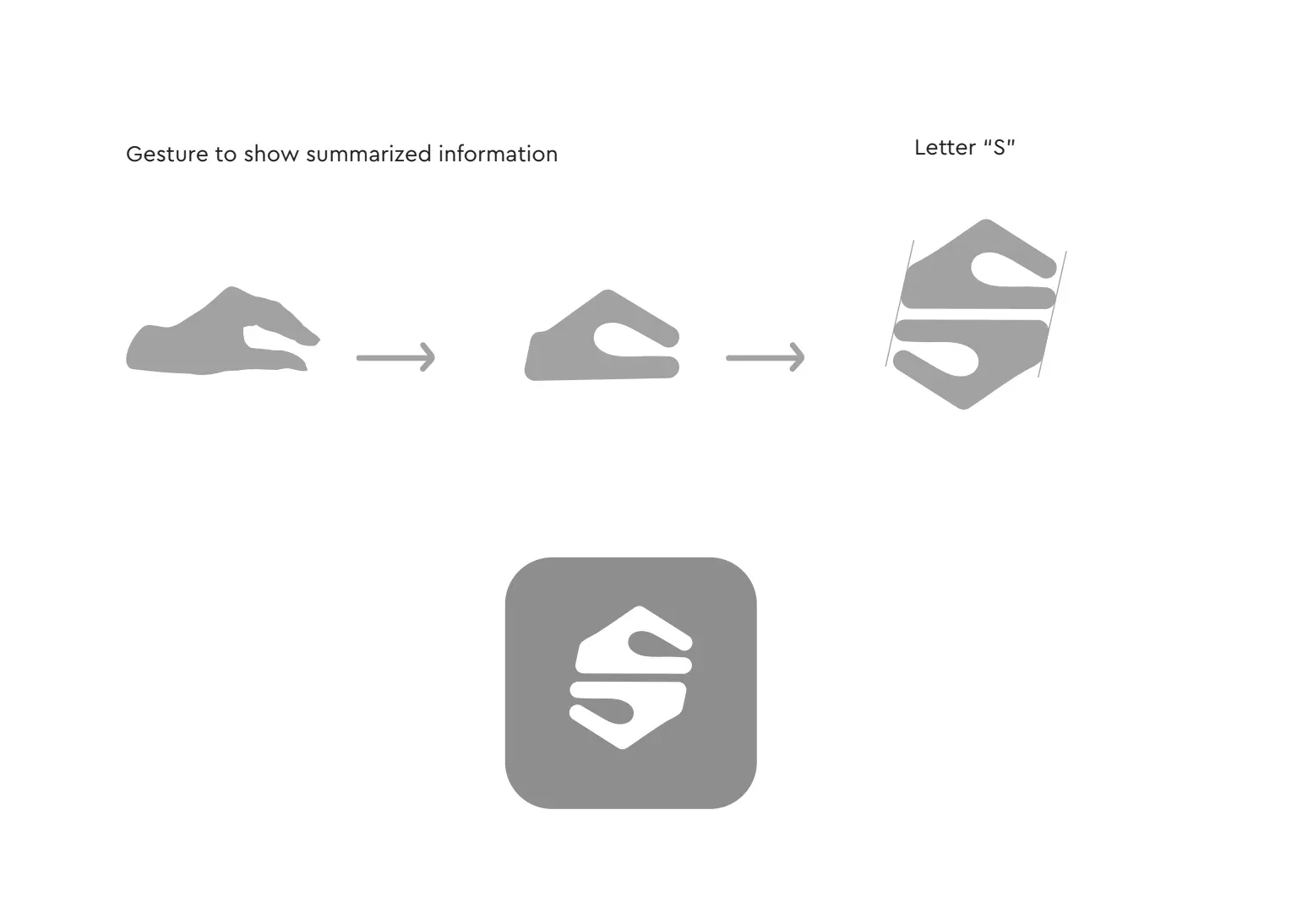
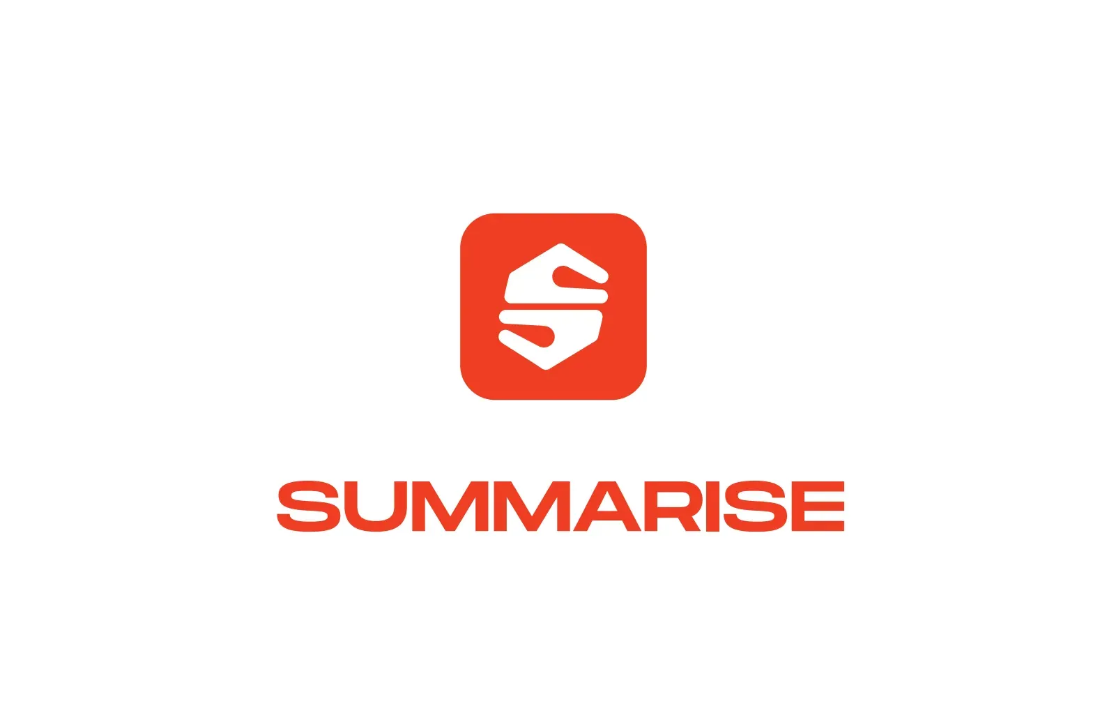
The identity design process was structured around a single constraint the positioning work had established: the mark had to communicate compression, curation, and human intelligence in a scalable icon that functions at 60 pixels — the minimum size at which an app icon must communicate independently on a Gen Z home screen. The logo was developed from a human reference: two hands facing each other, compressing content between them. The starting image — palms held open, facing inward — communicated the specific act of curation: gathering information from multiple sources and compressing it to what matters. For a platform whose content is sourced from real humans with knowledge and verified through a proprietary matching system, that gesture was not decorative. It was a direct representation of how the platform works. The geometric construction translated the gesture into a precise, scalable mark. Two interlocking bracket elements — each derived from the arc of a palm — were developed using a circle-based grid, with every joint and curve specified to maintain legibility from app icon scale to large-format application. The resulting form read simultaneously as a compression gesture, a human connection signal, and the letter S: carrying the full brand proposition in a single symbol without requiring any supporting typography to communicate it. The construction logic embedded a second layer of meaning. The two bracket forms face each other but do not touch — the negative space between them is the content that has been curated, the essential core that remains after everything unnecessary has been removed. The mark was specified for deployment on a Bright Red-Orange rounded square app icon — the format in which a Gen Z user encounters the brand first and most frequently. The colour decision was grounded in category analysis. Bright Red-Orange occupies a position adjacent to the legacy news platform register: familiar enough to be immediately categorised as a news and information platform, distinct enough to stand apart from every established player on the same screen. The communication visual system extended the brand's three operating principles into three campaign-deployable motifs: the funnel motif visualising curation, the core motif expressing the content standard, and the compact motif stating the user value proposition. Each motif was developed as a self-contained visual language element. The system was built to compound: every piece of communication reinforcing the same proposition through a different visual expression of the same underlying idea.

Zerologic Summarise_114
Identity
Zerologic Summarise_115
Identity
Zerologic Summarise_116
Identity
Zerologic Summarise_117
Identity
Zerologic Summarise_19
Identity

Your next phase

Build something that compounds.

Open a conversation about where your business is going.

Open a conversation