Client
FOID
Industry
Retail
Outputs
brand · identity · content · campaigns
Year
2022
The brief
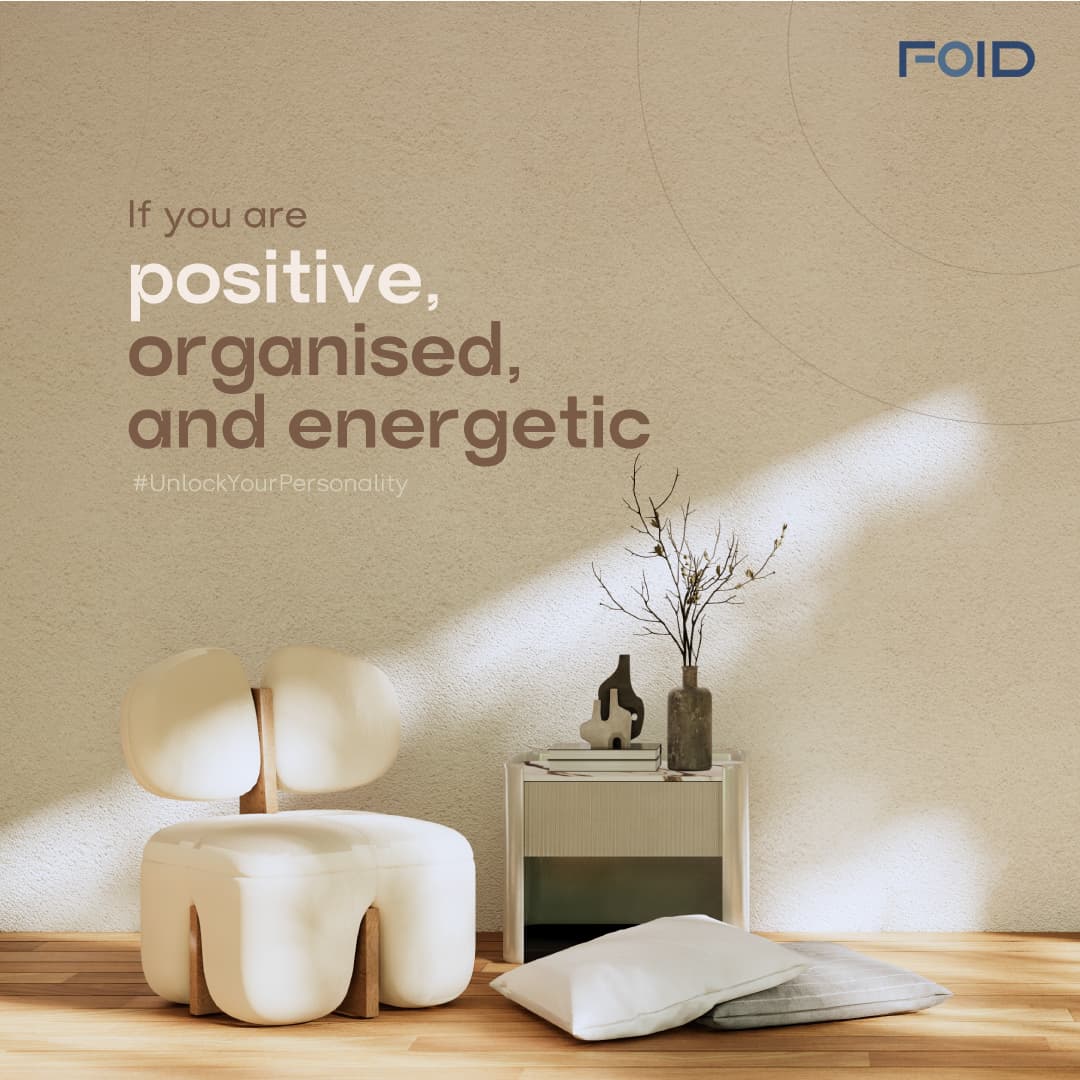
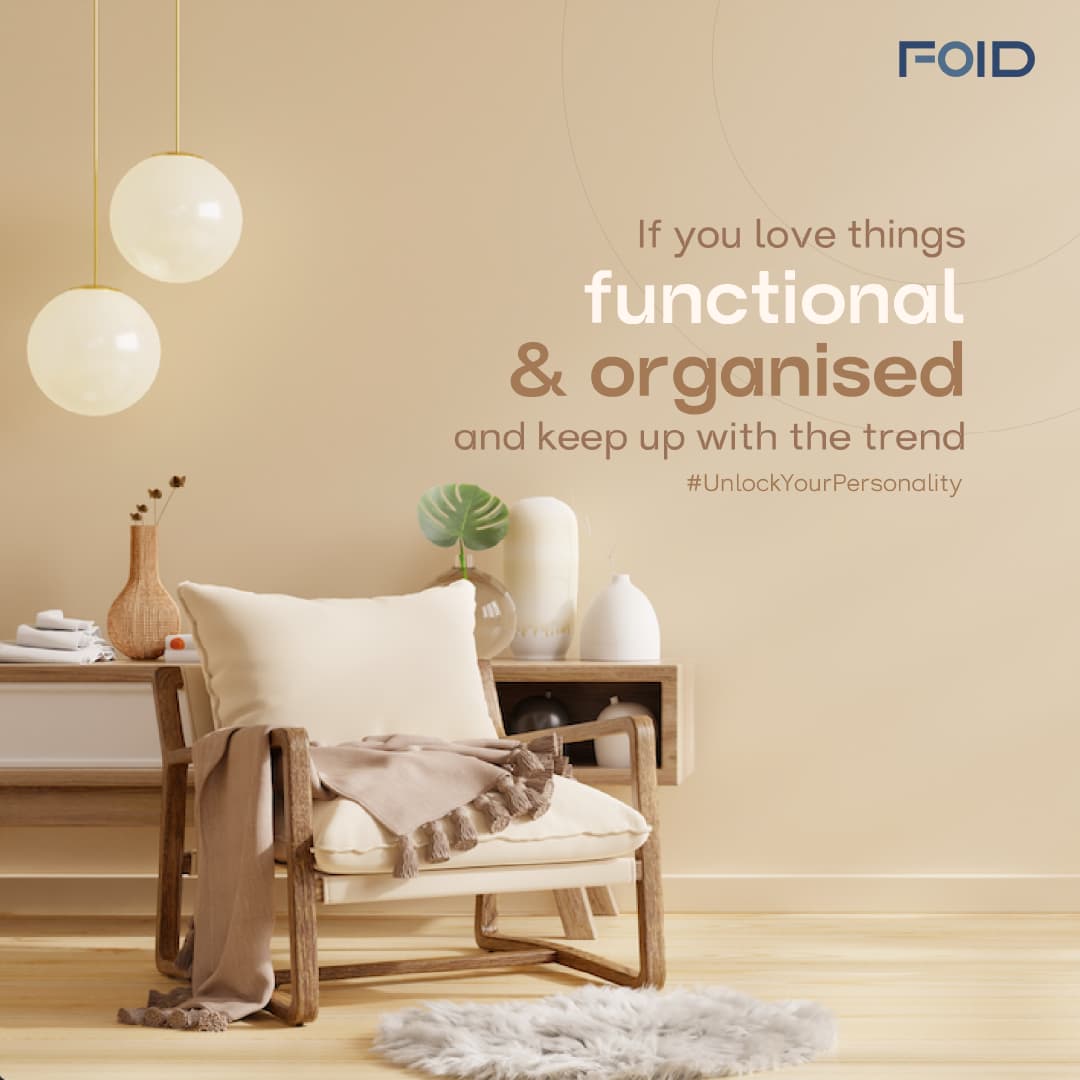
FOID came to Zerologic before the company had a name. The engagement ran from naming through to launch: name, positioning, identity system, brand pattern, collateral, store experience design, way finding, packaging, and social activation. For a space design studio, the identity is not decoration applied to the work. It is the first evidence a client has that the studio can think in systems.
Context
Likhitha Santoshi was building a bespoke space design studio in Hyderabad, designing and executing interiors end to end. The business existed. The brand did not, in any form, including a name.
The market had shifted underneath the category. After the pandemic, homes absorbed functions they were never designed for: office, classroom, gym, social venue. A room that only looked good had stopped being enough. Clients were asking spaces to work harder, adapt faster, and hold more.
The organised interiors market had not caught up. It still competed on visual promise and delivery certainty. Nobody was addressing the fact that the demand had moved from appearance to capability.
Process
What we found
People had started evaluating rooms by function, not finish. The behavioural shift was concrete. The same corner served three purposes across a single day. Buyers were no longer asking whether a space looked good. They were asking what it let them do. That finding produced the positioning and, eventually, the line: Designing Spaces, That Do More.
Space cannot be signified by depicting space. A rendered room dates within a season and says nothing a competitor cannot also say. The category needed a symbol, not an illustration.
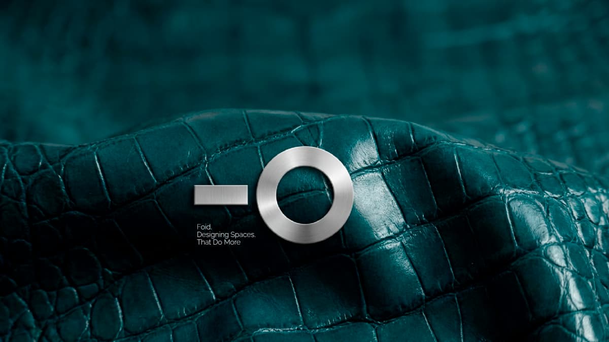
One object carries the entire meaning of space design. The key. It signifies access, ownership, threshold, and the exact moment a space becomes someone's own. Simple in form, sophisticated in its detailing. It was the only symbol that could hold the proposition without describing a room.
Drawn literally, a key is a real-estate cliché. So it was reduced. The teeth came off, then the detail, until only two primitives remained: a bar and a ring.
Those two primitives became the entire system.
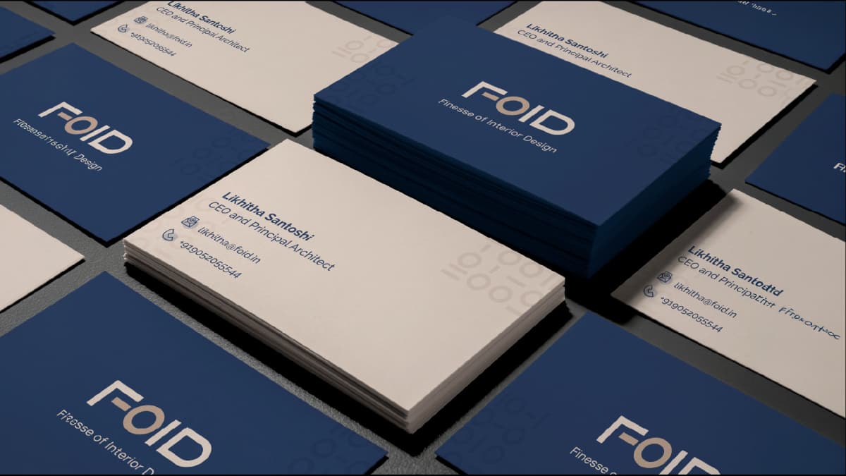
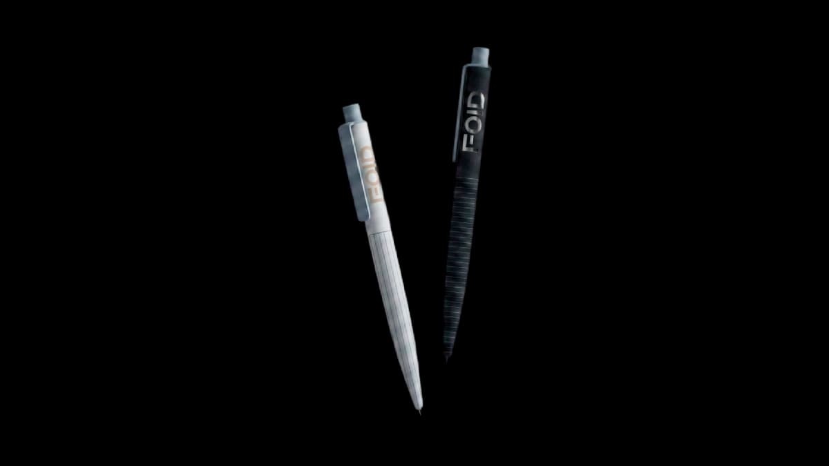
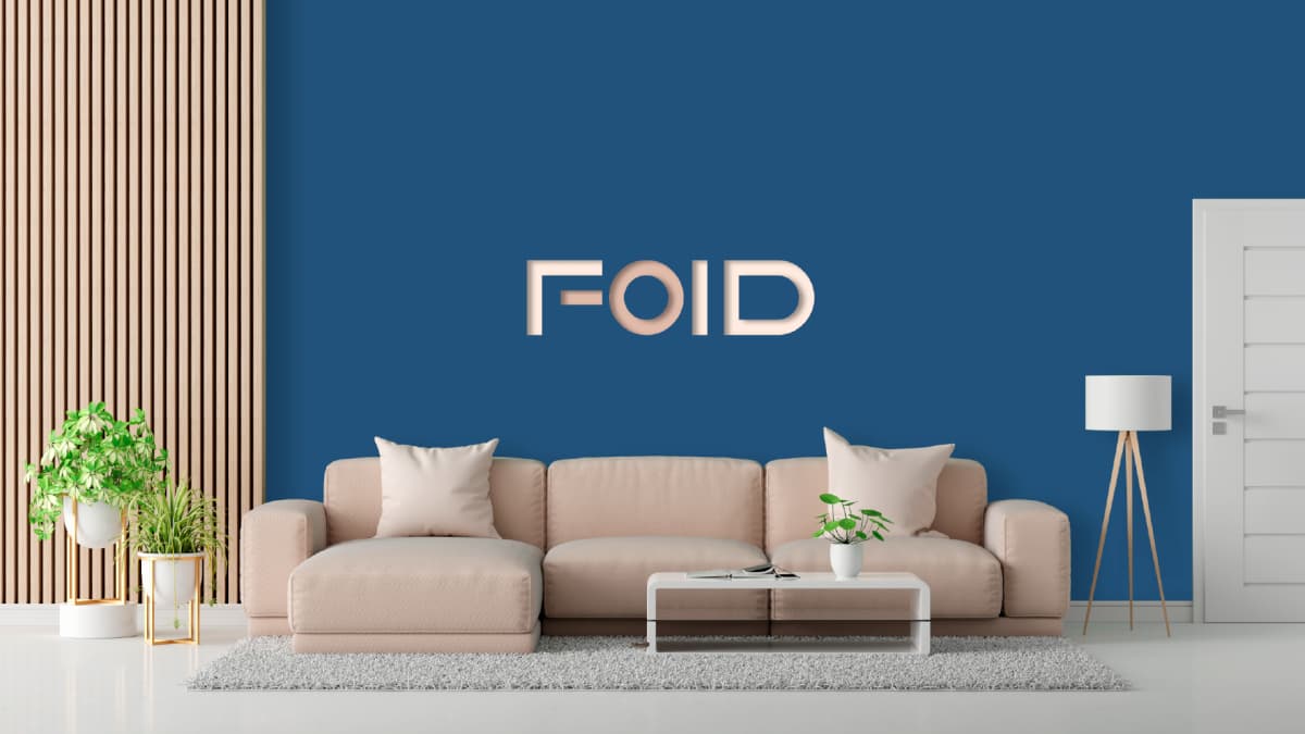
They build the logotype. F, O, I and D are each constructed from a bar and a ring, which means the mark and the wordmark are the same object rather than two things that have to be reconciled. The O carries the warm tone, holding the key's bow inside the name.
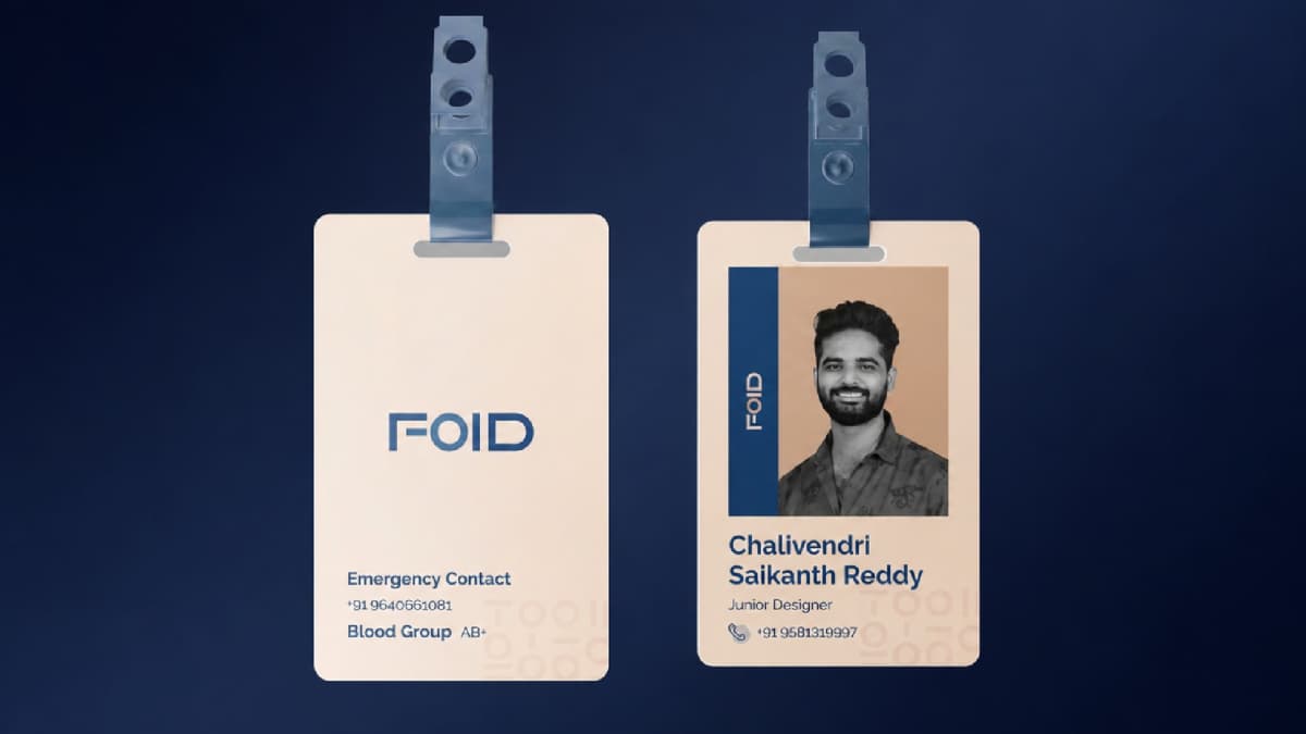
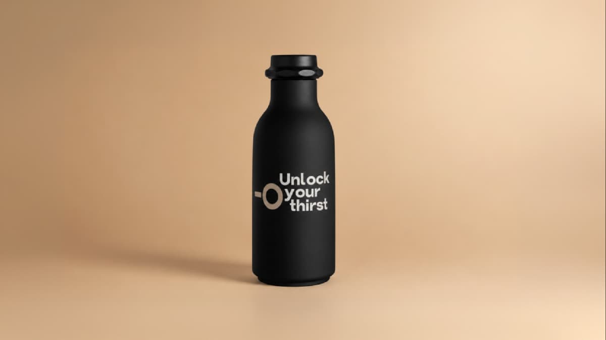
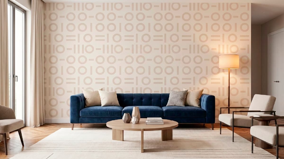
Broken apart and rearranged, the same two shapes generate the brand pattern. A modular field that reads as rhythm and code, scaling from a business card to an envelope flap to a full feature wall inside a client's home.
This is the part that matters. Modular interiors are a kit of parts recombined for each space. The identity was built on identical logic. Two components, endlessly recomposed, coherent at every scale. The brand demonstrates the studio's method before a single project is shown.
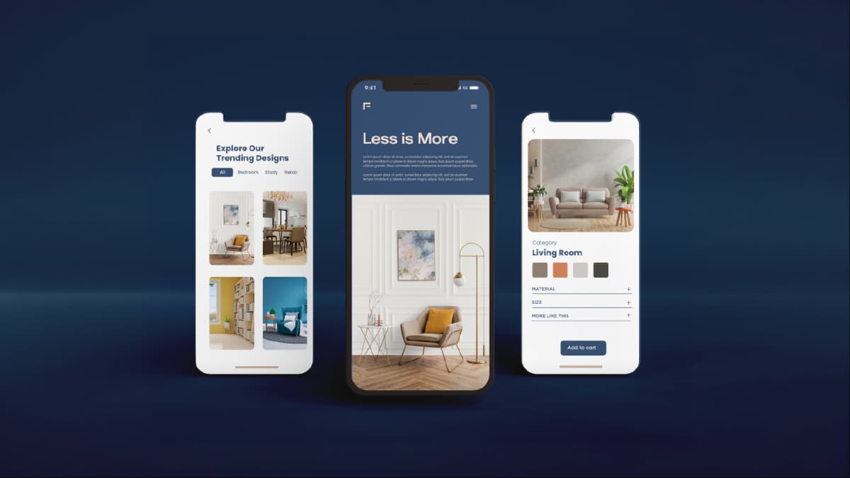
The palette holds the two halves of the proposition. Deep blue at #30486E carries competence and system. The warm tones at #D1B4A1 and #F8E7DA carry domesticity and skin. Rigour and warmth, which is precisely what a client wants from someone rebuilding their home. Trap Bold and Raleway Medium extend the same split, geometric construction paired with humanist legibility.
The badge proves the compression. At its smallest, the system holds with a single bar and a single corner.
Output
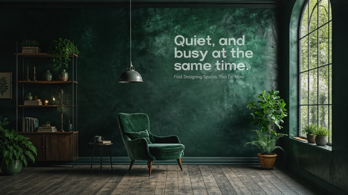
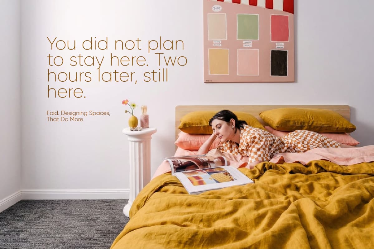
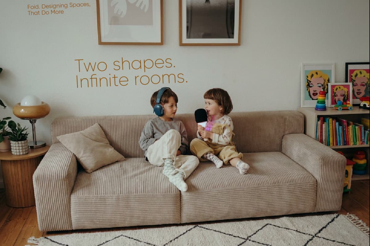
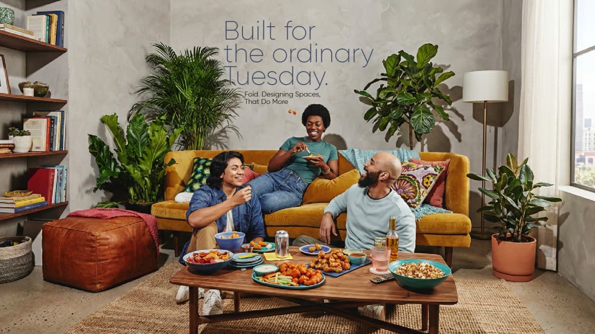
Reflection
Reducing the key was the decision the whole system rests on. Stopping one step earlier would have left a recognisable key and a conventional real-estate mark. Going one step further would have left two shapes with no origin story. The stopping point was the work.
The generative pattern is the highest-return element and the least visible one. It gave a new studio an infinite, ownable graphic asset on day one, at no production cost, applicable to stationery, packaging, and the interiors themselves. Most young brands buy that capability later and expensively.
Applying the pattern inside real spaces closed the loop between identity and product, and it is where the store experience work connects. The brand does not sit on the wall as a logo. It becomes part of the room it is selling.
What remains untested is stretch. Two primitives are disciplined and finite. As the studio adds categories, the system will be asked to carry more than it currently does, and the answer should be new arrangements rather than new shapes.
Creative outputs