

Client
Glater
Industry
FMCG
Outputs
brand · identity · campaigns · content · strategy
Year
2024
The brief
Glater commissioned brand identity and packaging design for an ultra-premium water brand served in designed glass, built for luxury hospitality and the fine-dining table. The brief arrived framed as a design problem: the category is visually saturated and the brand needed to look different. The problem underneath it was that looking different and being positioned differently are separate achievements, and only one of them survives contact with a wine list.

Context
The commercial case for entry is strong on paper. India's bottled water market is worth USD 9.14 billion in 2026 and growing at 10.39% CAGR, with the mass segment holding 85.12% of value in 2025 and the premium segment advancing at 11.71% CAGR to 2031. On-trade, the hotel and restaurant channel, is growing at 10.74%. Tata's CEO described premium water as a priority with a long runway, and premium water sales tripled during 2025 at three gourmet retail stores in India.
Which is also the problem. Every brand can read those numbers.
The category's incumbents are established and specific. VEEN has operated in India as a HORECA brand for close to a decade, serving over 400 hospitality accounts across roughly forty cities. It uses pharmaceutical-grade Type II flint glass, has been distributing in that packaging since 2012, and its bottle sits in the Helsinki Design Museum. Himalayan holds the Tata distribution machine. Evian and Perrier hold imported provenance. Evocus holds the alkaline claim.
The register they share is source and purity. The chief creative officer on Himalayan's most recent campaign put the constraint plainly: in this category, provenance is the price of entry. Everyone arrives with a mountain, an aquifer, or a mineral profile. Visually, everyone arrives in blue and clear.
Process



What we found
Competitors argue the what of hydration. Source, minerals, purity, pH. Nobody argues the how.
That is the open position, and in luxury it is the more valuable one. At a fine-dining table, the water is not consumed as a safety measure. It is poured, placed, and seen for the length of the meal. The experience of drinking it has been left entirely unclaimed while the category argues about where it came from.
Glater was positioned on the vessel and the act rather than the contents. The purpose is responsible convenience: in this segment the glass bottle is not a sacrifice made for the planet, it is the better object, and the environmental outcome arrives as a consequence of quality rather than as its price. That reframes sustainability from a cost the consumer absorbs into a property of the thing they already wanted.
Everything downstream follows.
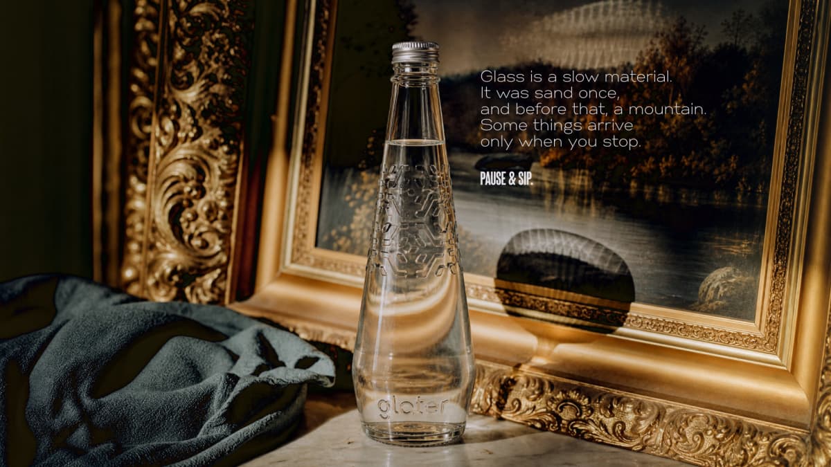
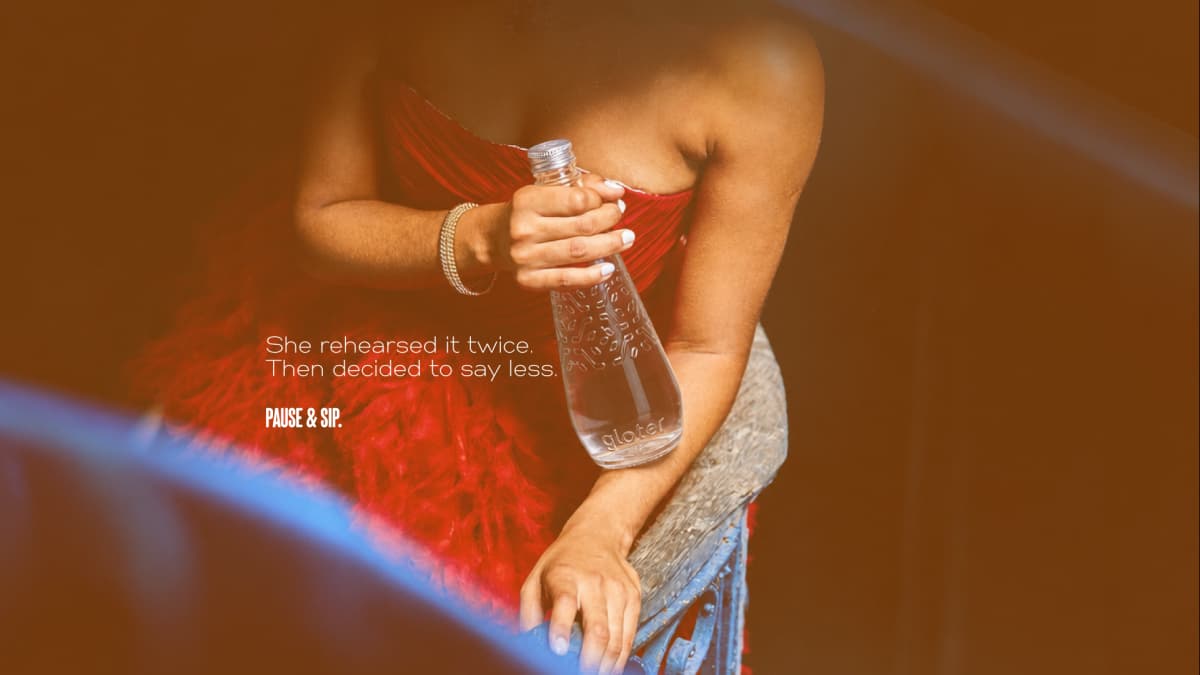
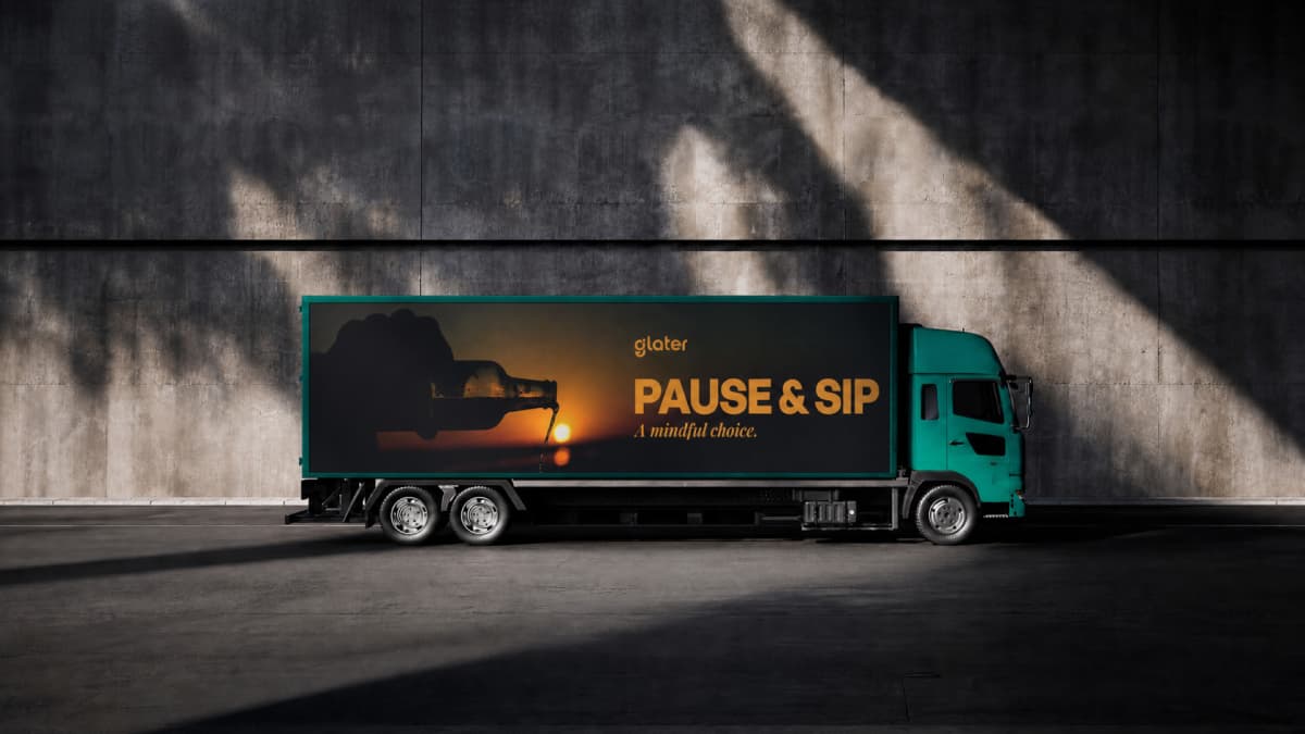
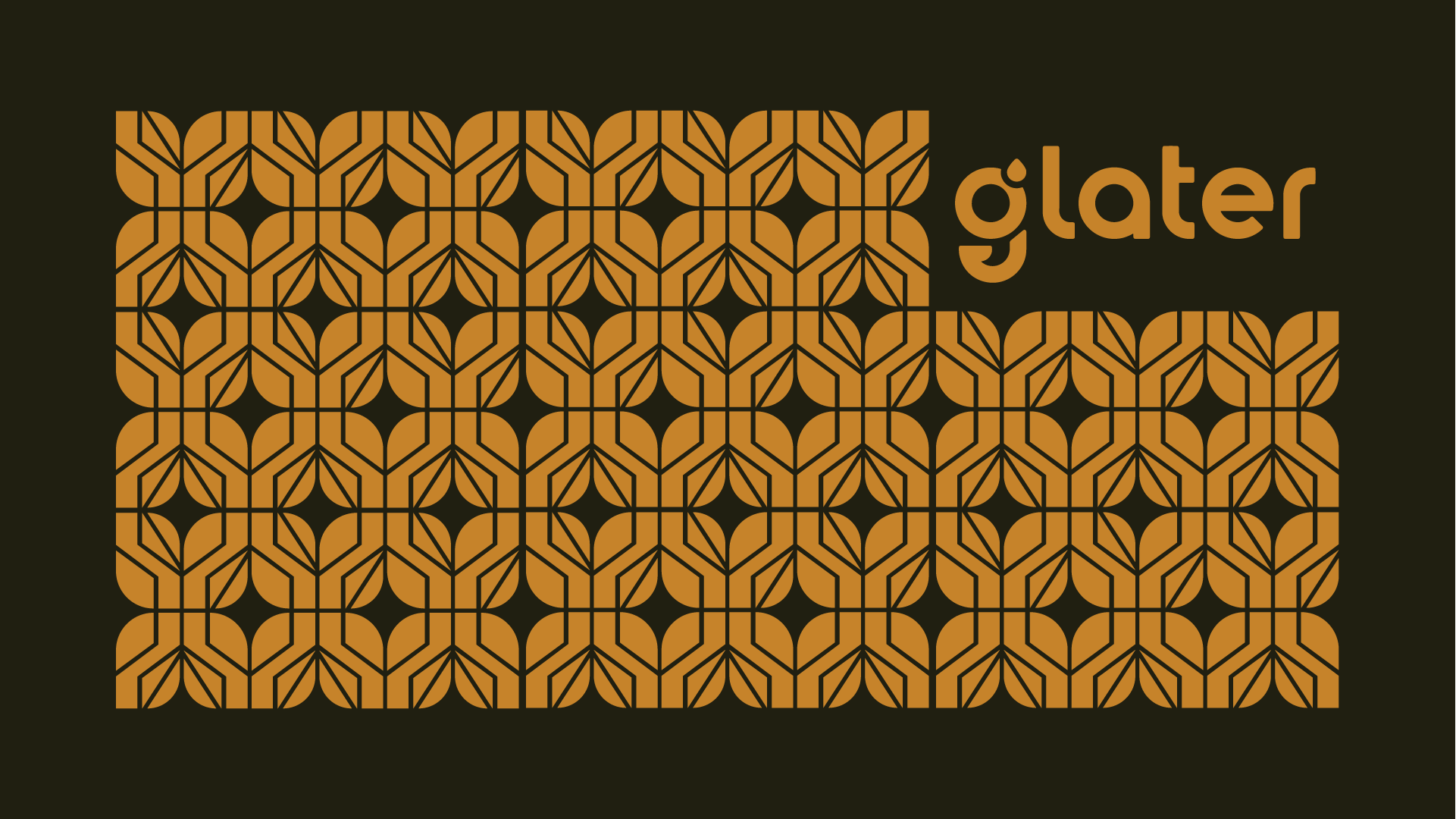
The palette went to amber against a category coded blue, on the logic of fossil resin holding time, depth and mystery. The dark-led 60/30/7/2 ratio moves the reference set sideways, out of packaged water and into spirits and hospitality, where quality has always been photographed low-lit and warm. The identity is built on a single primitive: a droplet that sets the isolation area, terminates the g and stands alone as the symbol, with a rule that symbol and logotype never appear together. The four values, transparency, resilience, rebellion and sustainability, were abstracted into geometric forms that generate the brand pattern, so the value system is the visual language rather than a page in a document. Voice runs on two registers: Pause and sip for the moment of consumption, Reconstruct. Rethink. for the category argument underneath it.
Output
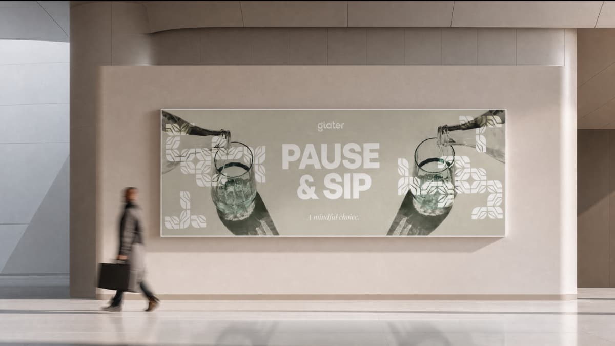
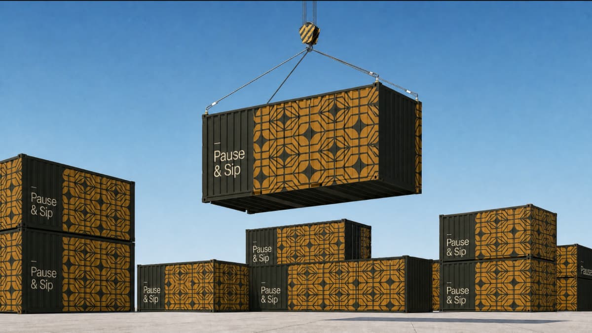
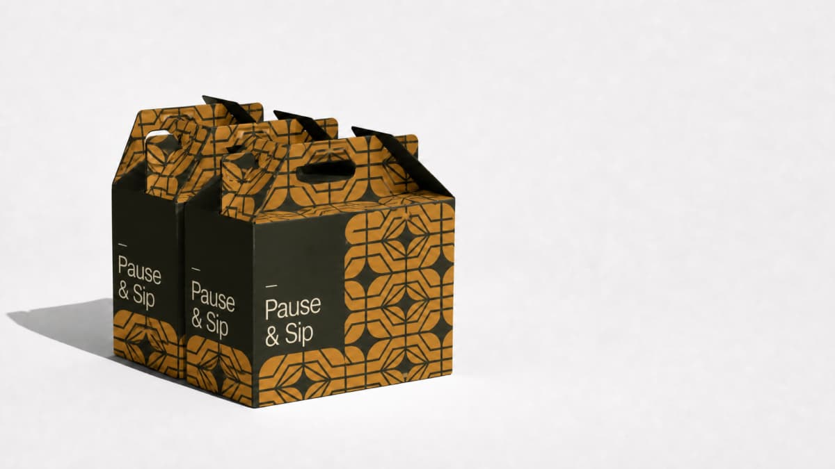
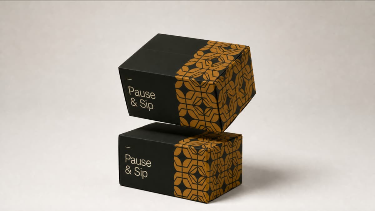




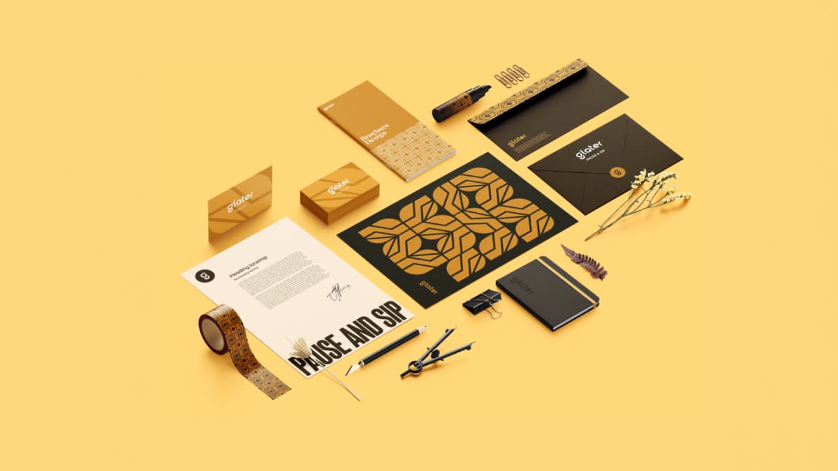
Reflection
Amber was the expensive decision. On a shelf coded for purity, an amber water brand does not read as water on first glance. That was accepted deliberately. A brand competing on the experience of drinking rather than on the contents cannot use the contents category's colour to say so, and a brand that looks like the 85% will be priced against it.
Rebellion is the value that does not belong in a water brand, and it is the one that made the system hold. A luxury brand signalling only refinement is indistinguishable from the imported stills already on the list. Glater had to be able to argue that the convenient version of this category is broken, and reassurance cannot make that argument.
The separation rule between symbol and logotype is the same discipline in miniature. In a category where provenance is the price of entry, a new brand cannot win on the story of where the water came from. It can win on being the most considered object on the table.