Client
EDIT - Effort Does It
Industry
D2C
Outputs
brand · identity · web
Year
2023
The brief
EDIT commissioned market research, brand identity and a communication system for a homegrown Indian sports brand entering sportswear, equipment and training, with an ecosystem roadmap extending into rehabilitation, events, athlete ranking and eventually facilities. The founder's ambition was stated plainly: not to compete with Decathlon but to surpass it. The brief was therefore never a logo brief. It was a question of what a domestic brand could credibly stand for that the incumbents structurally could not.
Context
The category is concentrated and well funded. Nike, adidas, PUMA, Decathlon and Under Armour held roughly 55 to 60% of India's branded sportswear revenue in 2025, and the sports apparel market was valued at around USD 909 million that year, projected to cross a billion the following year. Those players compete through celebrity partnerships and aggressive retail expansion.
A new entrant cannot match that spend and cannot match that distribution. It also cannot match the narrative, because the incumbents own the one the category runs on: victory. Champions, podiums, medals, the winning moment. That story is bought with athlete endorsements a homegrown brand cannot afford, and it describes an experience most of the addressable market has never had.
The founder's own trigger pointed at the gap. Atin Gupta spent three to four years researching the sports industry after struggling to find quality coaching for his daughter, a potential national-level swimmer. What he found was not a product shortage but an infrastructure one. India has a very large population and inadequate support for the people inside its sports community.
Process

What we found
Research across more than a hundred athlete journeys, spanning grassroots, semi-professional and aspirational competitive contexts, produced one finding that reorganised everything downstream.
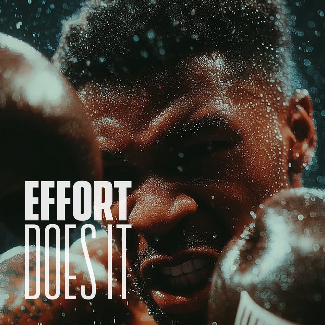
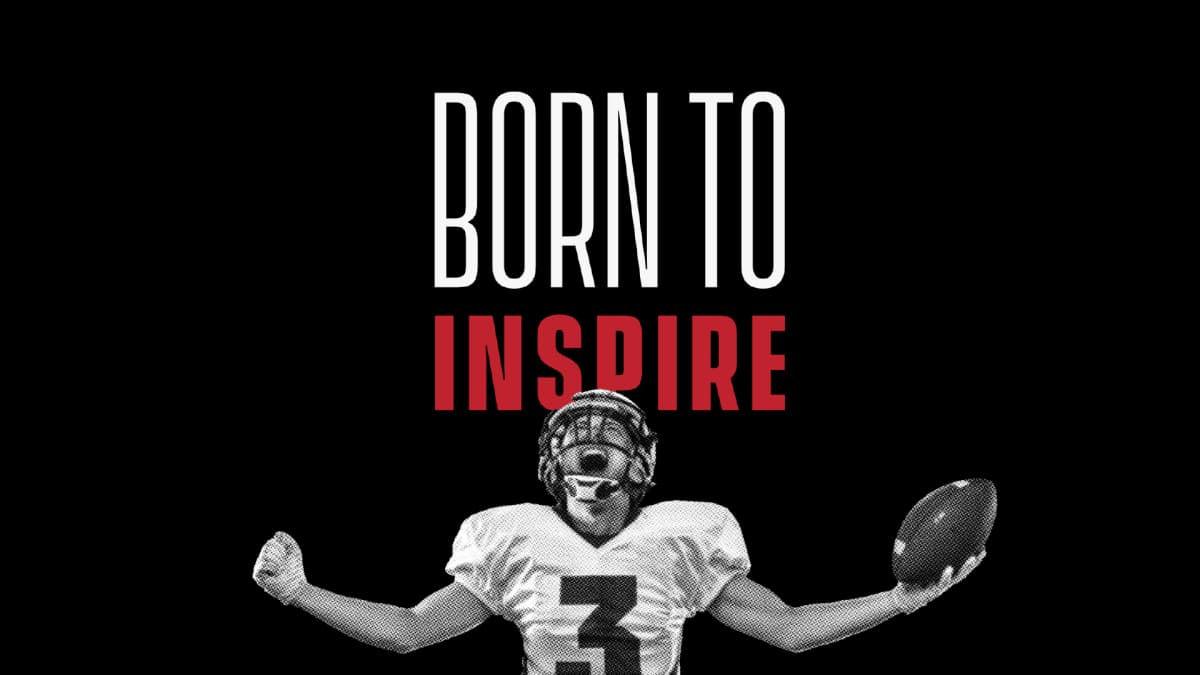
Athletes do not identify with victory. They identify with effort.
Victory is rare, brief and unrepresentative. Effort is daily, and it is where the actual experience of being an athlete lives: the early morning, the repetition, the missed shot, the injury, the loneliness of an empty ground, the rebuild after a loss. The category's communication skipped all of it and went straight to the podium, which meant the category was speaking to a version of the athlete that almost nobody was.
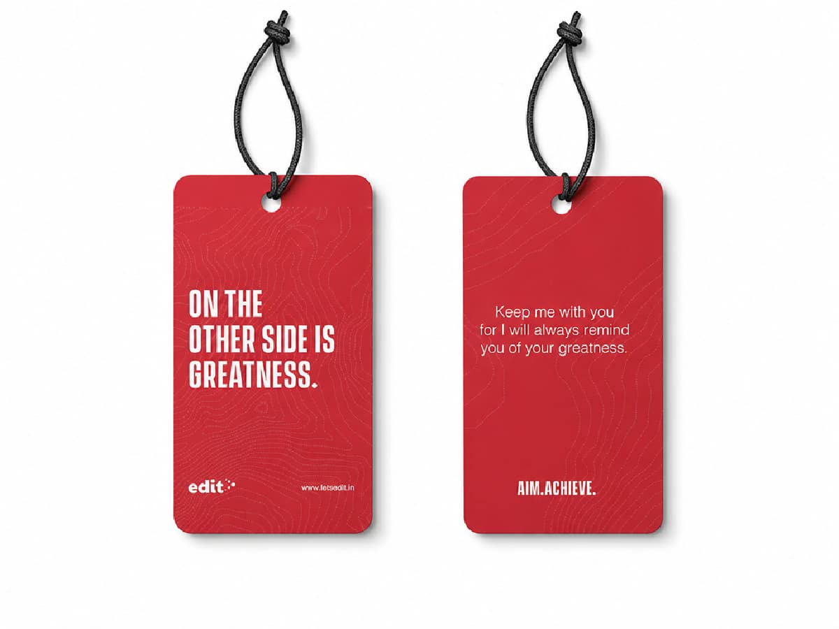
Effort is greater than everything. That is the positioning, and it is not a slogan. It is a comparative claim with a direction, and it became the literal construction of the identity.
The research produced a second finding that shaped the communication system rather than the identity. The obstacles athletes name are not primarily physical. They are financial, social and structural: gear shortages, family expectations, the studies-versus-sport conflict, and the recognition gap where talent goes unselected and minor sports go uncovered. A brand organised around effort has something to say to all of those. A brand organised around winning does not.
THE IDENTITY
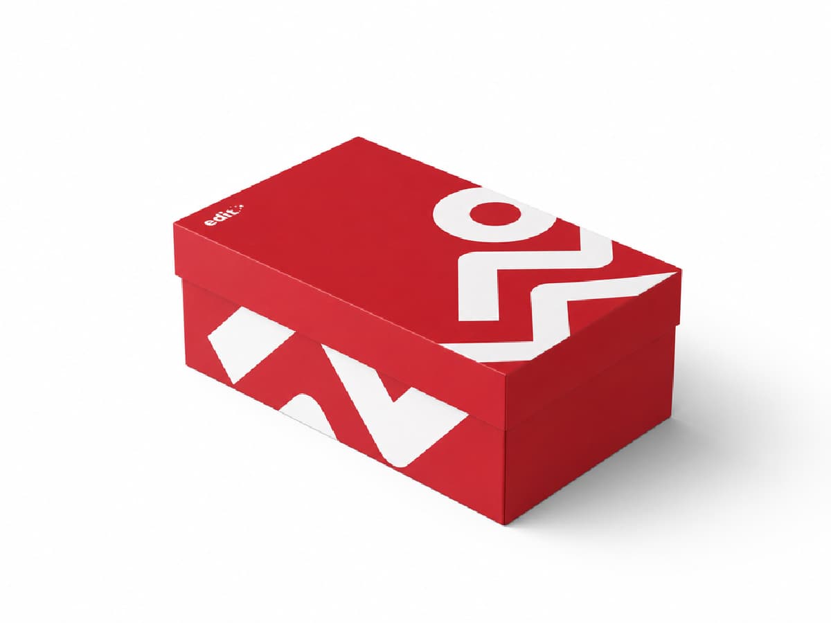
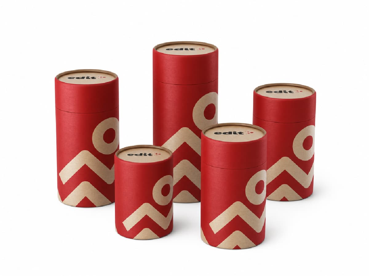
The mark is five dots. Each encodes a quality: self discipline, respect in the game, passion, and effort leading to achievement. Set on two converging diagonals, graduated in size across a proportional grid, they resolve into a greater-than symbol.
That is the whole argument in one glyph. The values are not listed beside the mark. They constitute it, and what they add up to is the comparison the brand exists to make.
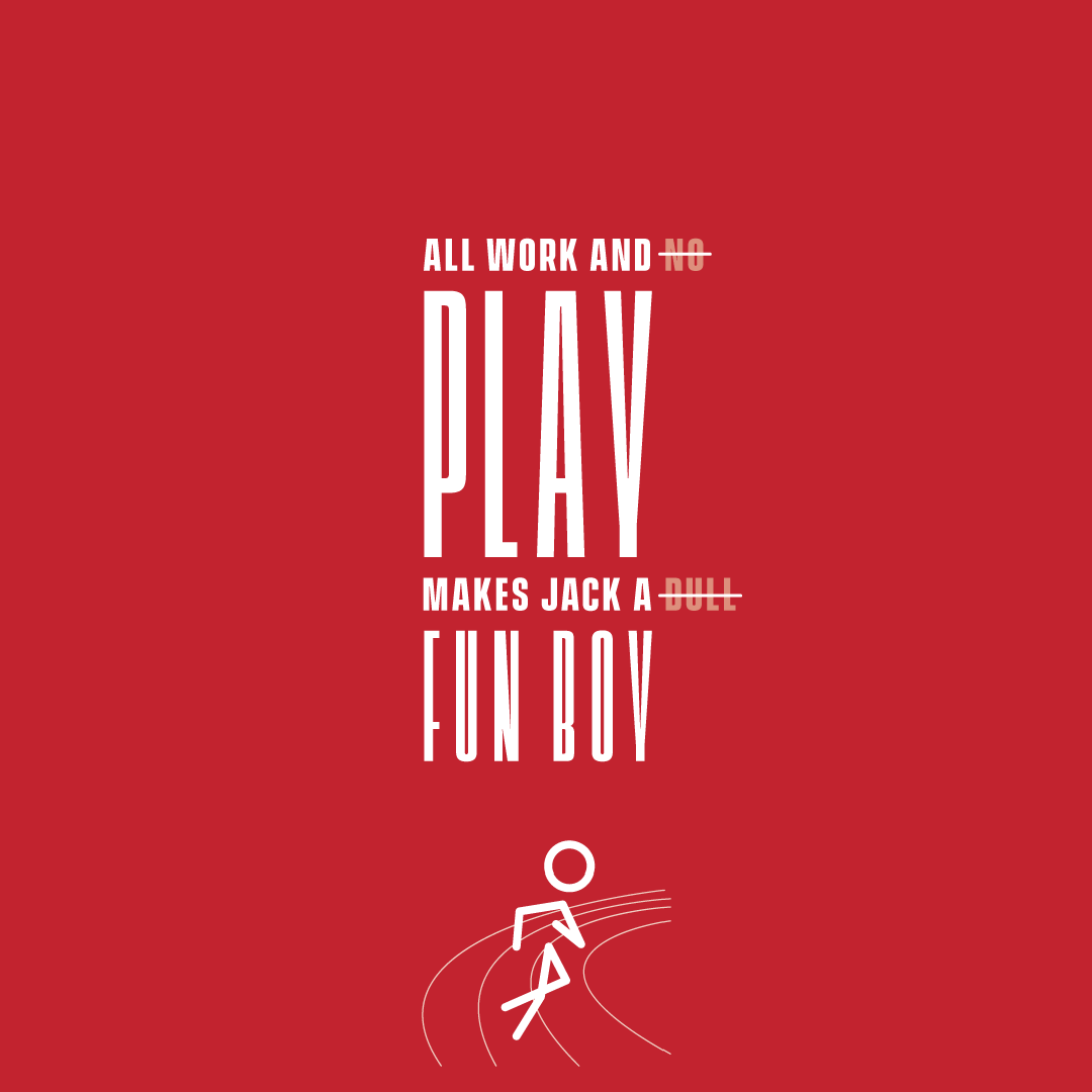
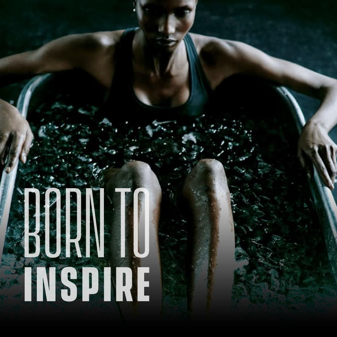
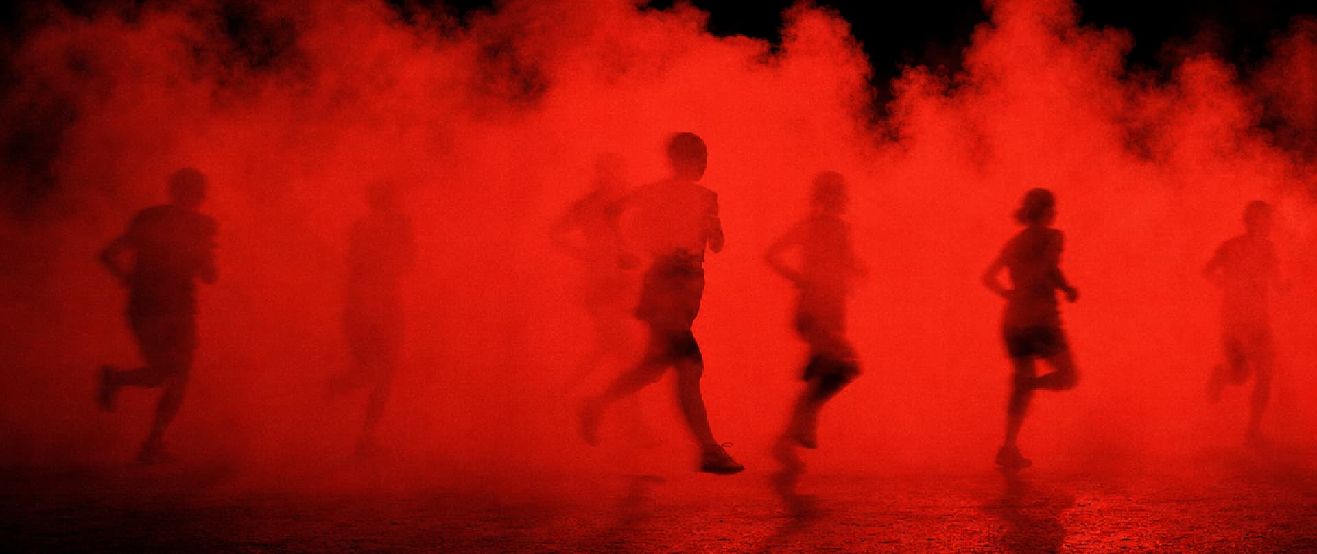
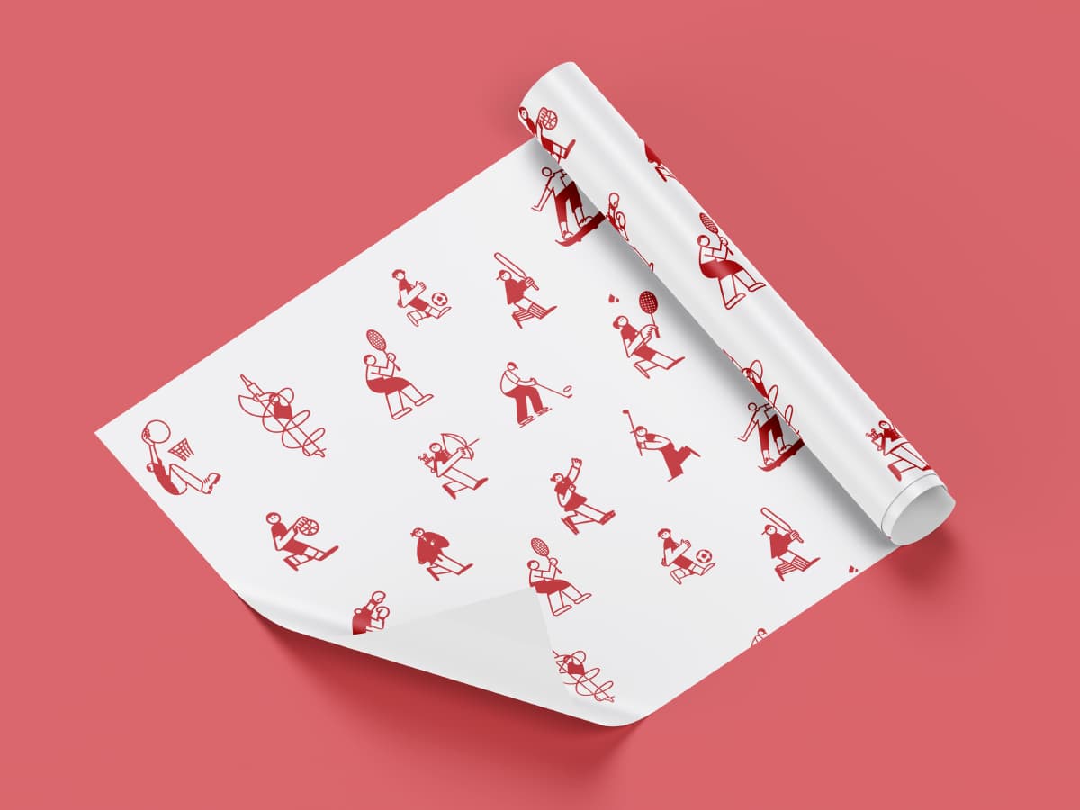
Direction is therefore a rule rather than a preference. The mark must always point right. Photography must show effort moving right rather than left. The running-man pattern may be rotated but never mirrored, because a reflected greater-than sign reverses the claim. The guidelines specify all three as absolute, which is unusual and correct. In most identity systems a mirroring restriction is an aesthetic nicety. Here it is the difference between the brand's proposition and its opposite.
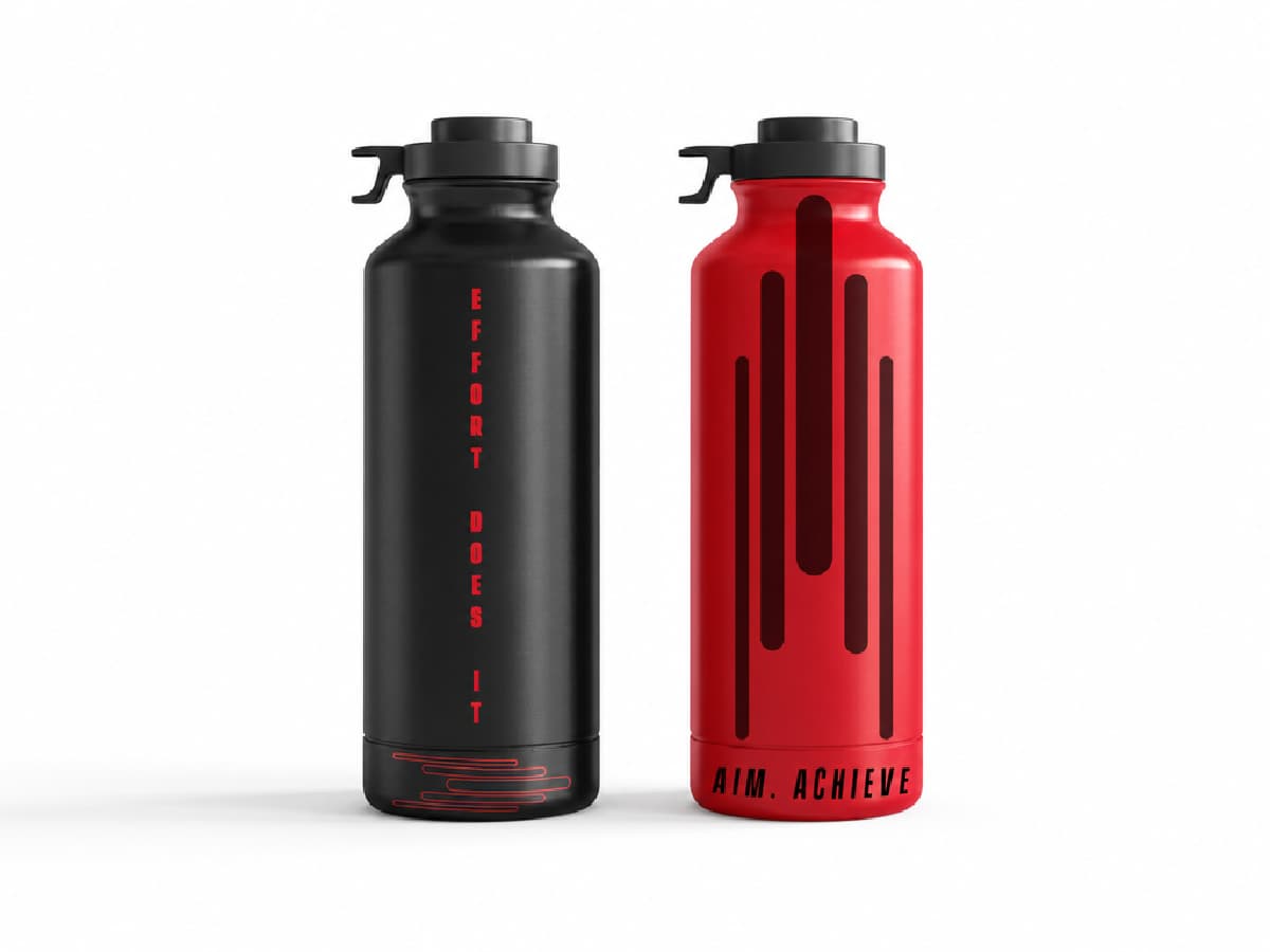
Red sits with black and white, carrying energy, strength, speed and competitiveness, with no fourth colour permitted. In a category where colour is used as seasonal differentiation, a fixed three-colour palette specified to the hex value is a governance decision more than a chromatic one.
Vanguard CF is the display face, capitals only, with one specified alternate treatment: letters may be stretched vertically by 40%, applied to no more than five words and never to sentences. That is a rule for making impact without adding elements. Helvetica, selected for legibility where the display face would be noise, carries all body communication.
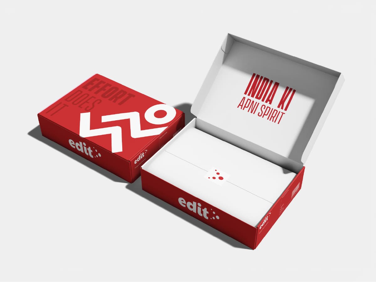
The system then propagates. Two patterns extend it: the running man for forward motion, and a second combining running, partnership and support to express the community EDIT intends to build. The illustration system inherits the primitive directly, since character heads are perfect circles taken from the logo dots, and figures are built on a five-head-high construct. One geometric unit governs the mark, both patterns and the illustration library, which is what allows a small team to produce consistent work across sportswear, equipment, retail and campaigns.
THE COMMUNICATION SYSTEM
Positioning that stays in a document does not survive contact with a content calendar. EDIT's was converted into an operating matrix: nine emotional territories including frustration, fear, loneliness and hope, eight sport types extending to para sports and traditional games such as kabaddi and mallakhamba, eight journey stages and a named challenge taxonomy.
The journey stages are the proof of the thesis. Early spark, training, preparation, performance, failure, reflection, rebuild, victory. Victory is one of the eight. Failure, reflection and rebuild are three of them. A brand organised around winning would not need those stages to exist.
The brand was also specified as a person rather than as a set of adjectives, with rehearsed positions on the objections the category actually meets. You are spoiling my child. I do not have time to play. Each is met with a move rather than a message: empathise, appreciate, align the goals. That converts tone of voice from a description into something a team can execute in a comment thread at 11pm.
A glossary completed the system, defining the brand's own vocabulary with the register fixed inside the definition. India ki apni spirit is defined as a spirit that plays for pride, not the podium, with its antonyms named as imported mindset and borrowed ambition. That is competitive positioning written as a dictionary entry, which is a more durable form than a tagline because it survives translation into any format.
Output
Reflection
The expensive decision was refusing the category's story. Sports brands sell aspiration because aspiration sells, and a brand about effort risks reading as consolation for people who did not win. It only works if the specificity is exact, which is why the research volume mattered. A generic effort message is a greeting card. An effort message that names the missed selection, the broken shoes and the studies-versus-sport argument is recognition, and recognition is what a brand without an endorsement budget can afford to buy.
The second decision was encoding the argument in the geometry rather than in the copy. A tagline can be changed by the next marketing hire. A mark that only reads correctly in one direction cannot be softened without visibly breaking, which means the positioning is enforced by the system rather than by anyone's discipline.
What the identity produced is a filter for seven subsequent engagements. Every product decision across bags, football, basketball, apparel and equipment resolves against one question: does this serve the athlete who shows up, or the one who wins.
Creative outputs