Skip to content
1 / 4
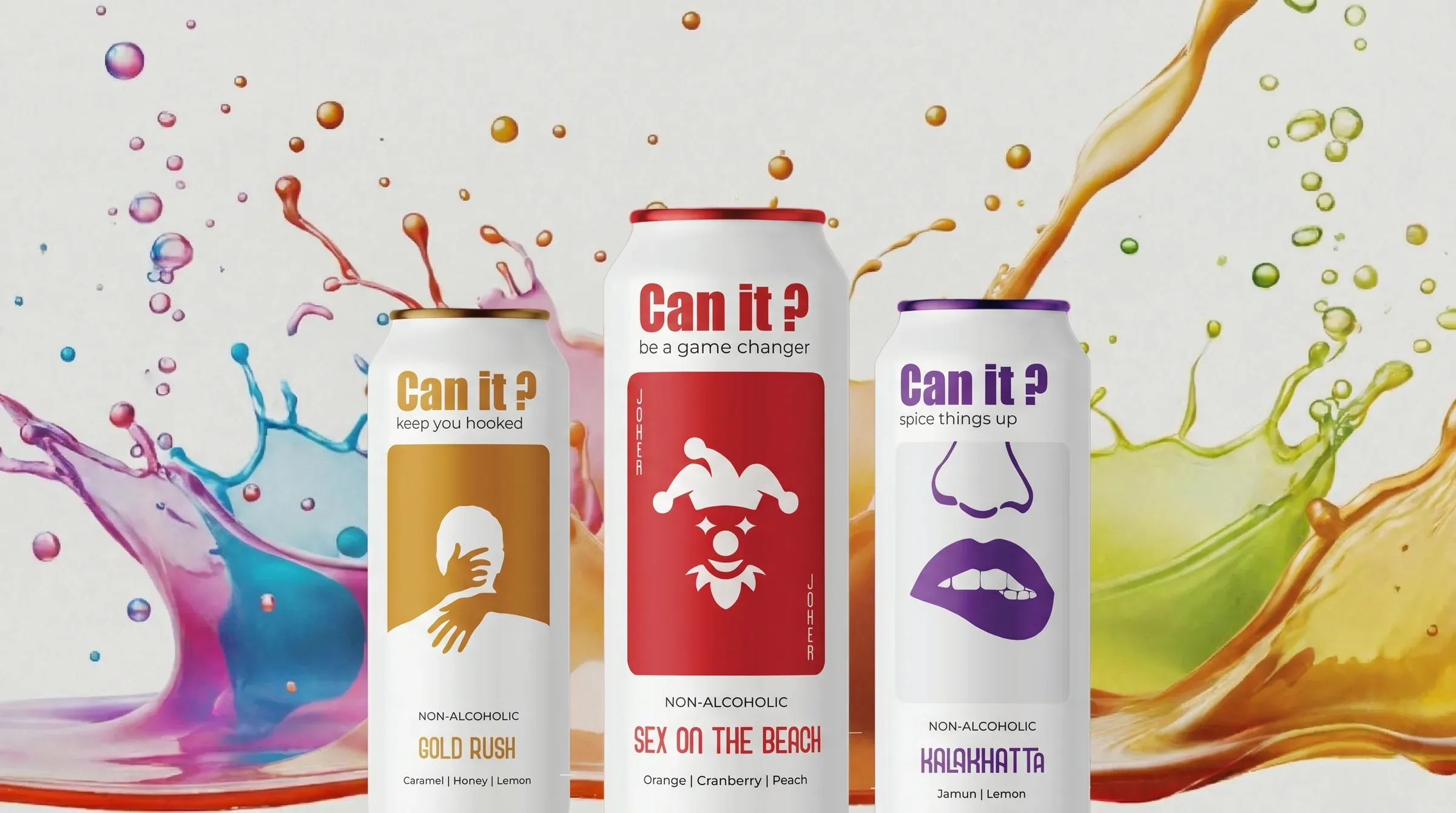
Flipcan — Can it? product hero

F&B

Flip Can Brand & Growth System

Indian flavour repositioned as the primary brand credential — the reason the product is chosen, not explained. A full brand and commerce system built from the inside of the customer's self-concept outward.

01Flip Can Brand & Growth…

The challenge

Flip Can had a designed product and a developed flavour range, but no brand system capable of communicating what the product actually was. No brand in the category had treated Indian flavour as a premium credential rather than a regional explanation requiring justification.

Client

Flip Can

Category

F&B

Phase

Build

Capabilities

5 deployed

The insight

The customer reaching for a Flip Can is reclaiming the experience of mixology as something that belongs to them — freed from the bar, the bartender, and the 1,200-rupee price point. Positioning Indian flavour as elevation rather than explanation resolved every downstream brand and design decision.

01 · Define

Behavioural research surfaces the positioning axis that resolves everything

Zerologic began with a behavioural research question — what does the person reaching for a Flip Can believe about themselves in that moment? Consumer and market research identified the gap: no brand had positioned Indian flavour as elevation rather than explanation. That single reframe produced a three-axis brand strategy: tradition as elevation, accessibility as empowerment, and sustainability as integrity built into the format rather than bolted on as messaging.

02 · Build

Flavour identity system, packaging, and commerce platform launched

An ingredient-led colour system translated the brand strategy into five distinct flavour identities — Gold Rush, Sex on the Beach, Kala Khatta, Green Mango Litchi, and Cosmopolitan — each visually individual yet recognisably a family. Packaging was designed to function in both product states: the can reads as premium on shelf, the tumbler as considered in the hand. The e-commerce platform was integrated within the brand experience rather than appended as a transactional layer, structuring the customer journey around flavour and self-concept before purchase mechanics.

Outcomes

Indian flavour repositioned as primary brand credential — the reason the product is chosen, not explained

Five flavour identities built into a coherent visual system: each distinct, all recognisably related

Dual-purpose packaging communicates the brand's accessibility positioning structurally, without copy

Visual system operates at two registers: premium alongside international cocktail brands, and immediately recognisable as Indian

E-commerce experience integrated within the brand world rather than appended as a transactional layer

Brand built from the inside of the customer's self-concept outward — design earns recognition rather than demanding explanation

Frequently asked
What was the strategic starting point for Flip Can's brand?
The starting point was a behavioural research question: what does the person reaching for a Flip Can believe about themselves in that moment? That question surfaced the market gap — no brand had treated Indian flavour as a premium credential rather than a regional explanation — and organised every design decision that followed.
How does the Flip Can visual system work across five flavour variants?
The colour architecture is ingredient-led: each flavour's visual identity derives directly from the ingredient itself. Deep purples for Kala Khatta, vibrant oranges for Cosmopolitan, warm golds for Gold Rush. The system makes flavour legible before the label is read, while keeping all five variants recognisable as a single family.
How did the dual-purpose packaging inform the brand strategy?
The can-to-tumbler format is the brand's primary physical gesture: it communicates that the cocktail experience belongs to the customer wherever they are, without requiring a bar or a bartender. Sustainability is carried structurally by the format itself, not added as messaging.
What was Zerologic's scope on this engagement?
Zerologic led brand strategy and positioning, visual identity, flavour identity system, packaging design across two product states, website design, and e-commerce platform development. The engagement spanned DEFINE and BUILD phases.
Why was the website structured around flavour rather than product?
The customer's primary question is not functional — it is experiential. The website was designed to answer what this tastes like, when to drink it, and what it says about me before answering volume, ABV, and price. Encounter the flavour world first; encounter the purchase decision second.

Your next phase

Build something that compounds.

Open a conversation about where your business is going.

Open a conversation